
Global header: Canada.ca design
- Last updated: 2025-03-27
Mandatory
The global header is at the top of each web page from the Government of Canada.
Having the same global header on all pages:
- strengthens the Canada.ca brand
- promotes trust
- provides a unified experience on the Government of Canada web presence
- allows navigation across the broad range of services and information offered
2023 design update: We’ve recently updated this pattern as part of a new navigation strategy coming out of the Wayfinding research project. To find out more about this project, visit Research and rationale.
On this page
When to use
The global header is mandatory on all Government of Canada web pages. Determine which header elements to use based on the type of page you’re creating.
Standard pages
Standard pages are pages where people can navigate away without losing data, triggering errors or terminating their session.
Global header requirements for a standard page
| Header element | Mandatory |
|---|---|
| Government of Canada signature (linked to Canada.ca home) | Mandatory |
| Language toggle | Mandatory |
| Site search box | Mandatory |
| Divider line | Mandatory |
| Theme and topic menu | Mandatory (Note) |
| Breadcrumb trail | Mandatory |
| Sign in button | Optional |
| Background colour (white) | Mandatory |
Transactional pages
Transactional web pages are pages with an interaction task where people might lose data, trigger errors, or terminate their session if they navigate away from the page.
Global header requirements for transactional pages
| Header element | Mandatory |
|---|---|
| Government of Canada signature (linked to Canada.ca home) | Mandatory (Link to Canada.ca home page is optional) |
| Language toggle | Mandatory (Note) |
| Site search box | Optional |
| Sign in button | Optional |
| Divider line | Mandatory |
| Theme and topic menu | Optional |
| Breadcrumb trail | Optional |
| Background colour (white) | Mandatory |
Return to footnote Note referrer: New transactional pages for web applications must allow people to toggle between official languages. Legacy web applications that don’t support toggling should be updated or replaced. Until then, you can omit the language toggle if its use results in a loss of data. |
|
Campaign pages
Campaign pages are landing pages for external marketing or advertising campaigns. The flexibility in layout allows institutions to match elements of their external campaign with the landing page.
Global header requirements for a campaign page
| Header element | Mandatory |
|---|---|
| Government of Canada signature (linked to Canada.ca home) | Mandatory |
| Language toggle | Mandatory |
| Site search box | Mandatory |
| Sign in button | Optional |
| Divider line | Mandatory |
| Theme and topic menu | Optional |
| Breadcrumb trail | Mandatory |
| Background colour (white) | Mandatory |
What to avoid
Don’t customize the mandatory elements of the global header, beyond what is recommended in the guidance for each. Consistency in this space is essential for building brand awareness and user trust.
For example, the flag symbol in the Government of Canada signature should always be the proper red and the first breadcrumb link should always be labeled “Canada.ca” and point to the Canada.ca home page.
Content and design
Find content and design specifications and visual examples.
- Government of Canada signature
- Language toggle
- Site search box
- Sign in button
- Theme and topic menu
- Breadcrumb trail
Visual examples
Standard pages
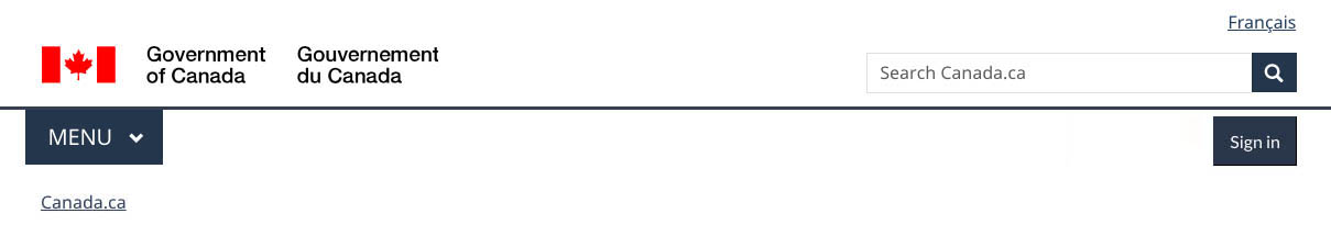
Image description: global header – large screen
On large screens, the global header on a standard page has 4 rows:
- Language toggle in the top-right corner
- Government of Canada signature in the left corner, site search box on the right
- Below a divider line, the theme and topic menu is on the left, the optional Sign in button is on the right
- Breadcrumb on the left

Image description: global header – small screen
On small screens, the global header on a standard page has 4 rows:
- Government of Canada signature in the top-left corner, language toggle in the top-right corner
- Site search box directly below, it spans the entire row
- Below a divider line, the theme and topic menu is on the left, the optional Sign in button is on the right
- Breadcrumb on the left
Transactional pages
Image description: minimum global header - large screen
On large screens, the minimum global header on a transactional page has 2 rows:
- Language toggle in the top-right corner
- Government of Canada signature in the top-left corner with a divider line underneath
Image description: minimum global header - small screen
On small screens, the minimum global header on a transactional page has a single row:
- Government of Canada signature in the top-left corner, language toggle in the top-right corner, with a divider line underneath
Campaign pages

Image description: minimum global header - large screen
On large screens, the minimum global header on a campaign page has 3 rows:
- Language toggle in the top-right corner
- Government of Canada signature in the top-left corner, site search box on the right
- Below a divider line, the breadcrumb on the left

Image description: minimum global header - small screen
On small screens, the minimum global header on a campaign page has 3 rows:
- Government of Canada signature in the top-left corner, language toggle on the far right
- Site search box directly below, it spans the entire row
- Below a divider line, the breadcrumb on the left
How to implement
Find working examples and code for implementing the header.
GCweb (WET) theme implementation reference
The implementation reference includes how to configure each element of the header.
Implementations
Determine what best suits the type of page you're creating. Refer to your implementation's guidance if you want to exclude breadcrumbs.
GC-AEM
For the Government of Canada Adobe Experience Manager (AEM):
Research and rationale
Consult research findings and policy rationale.
Research findings
Two research projects informed the latest updates to the header guidance.
Trust Signals for Canada.ca study
Our Canada.ca trust study and prior research show that a consistent header is necessary to maintaining a trusted brand.
For example, people trust:
- the flag in the Government of Canada signature more when it’s red
- a white background more than dark mode
If you want to know more about this research, contact the Canada.ca Experience Office at dsd.ceo-bec.dsn@servicecanada.gc.ca.
Wayfinding on Canada.ca project
We updated the global header for Canada.ca to align with a new overall navigation strategy that came out of the Wayfinding research project.
- Wayfinding on Canada.ca research summary
Explains the context of the research and the insights that drove the design updates - Wayfinding research project improves our approach to navigation on Canada.ca
Blog post explaining the changes that are being made to the Canada.ca design, and how they are being implemented
Policy rationale
This pattern is a mandatory element of the Canada.ca Specifications.
Latest changes
- Updated pattern to reflect design changes from the trust study and wayfinding project, added advice on what to avoid, added visual examples for the different types of pages, included links to research projects that inform header guidance
- Updated content design for clarity, added contextual Sign in button, added implementation resources to the global header
- The small screen version was modified to a slimmer version
Page details
- Date modified: