
Theme and topic menu: Canada.ca design
- Last updated: 2025-07-08
Mandatory on standard pages
The theme and topic menu provides access to the top tasks from all Government of Canada websites grouped under the main themes of Canada.ca.
On this page
When to use
2023 design update: We’ve recently updated this pattern as part of a new navigation strategy coming out of the Wayfinding research project. The theme and topic menu is in transition. To find out more about this project, visit the Research and rationale section on this page.
Current situation
Apply the theme and topic menu as follows:
- campaign pages optional
- transactional pages optional but not recommended
- theme and topic pages mandatory
On standard destination pages and institutional landing pages, the theme and topic menu is mandatory until ALL the following conditions are met:
- the page has the 2023 global footer
- the menu regularly receives less than 1% of clicks within a group of related pages
- if you’re adopting the design for the first time, you don’t need to add the menu
- you’ve added a contextual Sign in button where it’s relevant to the content
A group of pages might be all the pages related to a specific program or service, or all the pages related to a single organization.
Future state
Eventually we will retire the theme and topic menu pattern. Links to the theme pages will remain available through the main band of the global footer and the breadcrumb trail.
What to avoid
Don’t repurpose the Theme and topic menu for other navigation. The menu is a global navigation tool. It’s confusing for users if it behaves differently depending on where they are in the site.
Don’t remove it from standard destination pages before you meet the conditions above.
Don’t change the style or colour scheme.
Don’t put additional links or text in the flyout.
Content and design
The theme and topic menu consists of 3 integrated elements - the menu button which opens and closes the menu, the theme list that allows for choosing between themes, and the flyout that presents topics and most requested links for each theme.
Content specifications
- Menu button:
- label is “Menu” with a downwards caret
- Theme list, which includes the 16 main Canada.ca themes in the following order:
- Jobs and the workplace
- Immigration and citizenship
- Travel and tourism
- Business and industry
- Benefits
- Health
- Taxes
- Environment and natural resources
- National security and defence
- Culture, history and sport
- Policing, justice and emergencies
- Transport and infrastructure
- Canada and the world
- Money and finances
- Science and innovation
- Manage life events
- Flyout:
Hovering or clicking on one of the 16 themes reveals a flyout containing:
- a link to the landing page for the theme itself
- first-level topics within that theme
- Most requested links based on the highest demand items for that theme
Topics and Most requested links should appear in the same order on both the menu and the theme page.
Interactions
Large screens
- Clicking on the menu button expands the theme list element with the Jobs flyout open
- Once opened, hovering or clicking on one of the 16 themes reveals a flyout for that theme
- Clicking on the menu a second time closes it
Small screens
- Tapping the menu button expands the theme list as a series of submenu options
- Tapping any theme option expands the list of topics for that theme and reveals another submenu option for the Most requested
- Tapping the Most requested option expands the list of most requested links for that theme
- Tapping any expanded item again will close it
Design specifications
- Menu button styles:
- Background colour: primary accent colour (#26374a)
- Text colour: white (#FFFFFF)
- Text size: 20px or 1em
- Font: Noto Sans
Note: The homepage of Canada.ca uses different styling for the menu button. That styling is reserved for the homepage only.
- Theme list styles:
- Background colour: #444
- Text colour: white (#FFF)
- Background colour selected: #FFF
- Text colour when selected: dark grey (#333)
- Text size: 18px
- Font: Noto Sans
- Flyout styles:
- Background colour: primary accent colour (#FFF)
- Text colour: white (#284162)
- Text size: 18px
- Text size theme title: 32px
- Font: Noto Sans
Accessibility
Style the menu button label as capital letters, but write the label in sentence case (Menu), so screen readers don't read each letter individually.
Visual examples
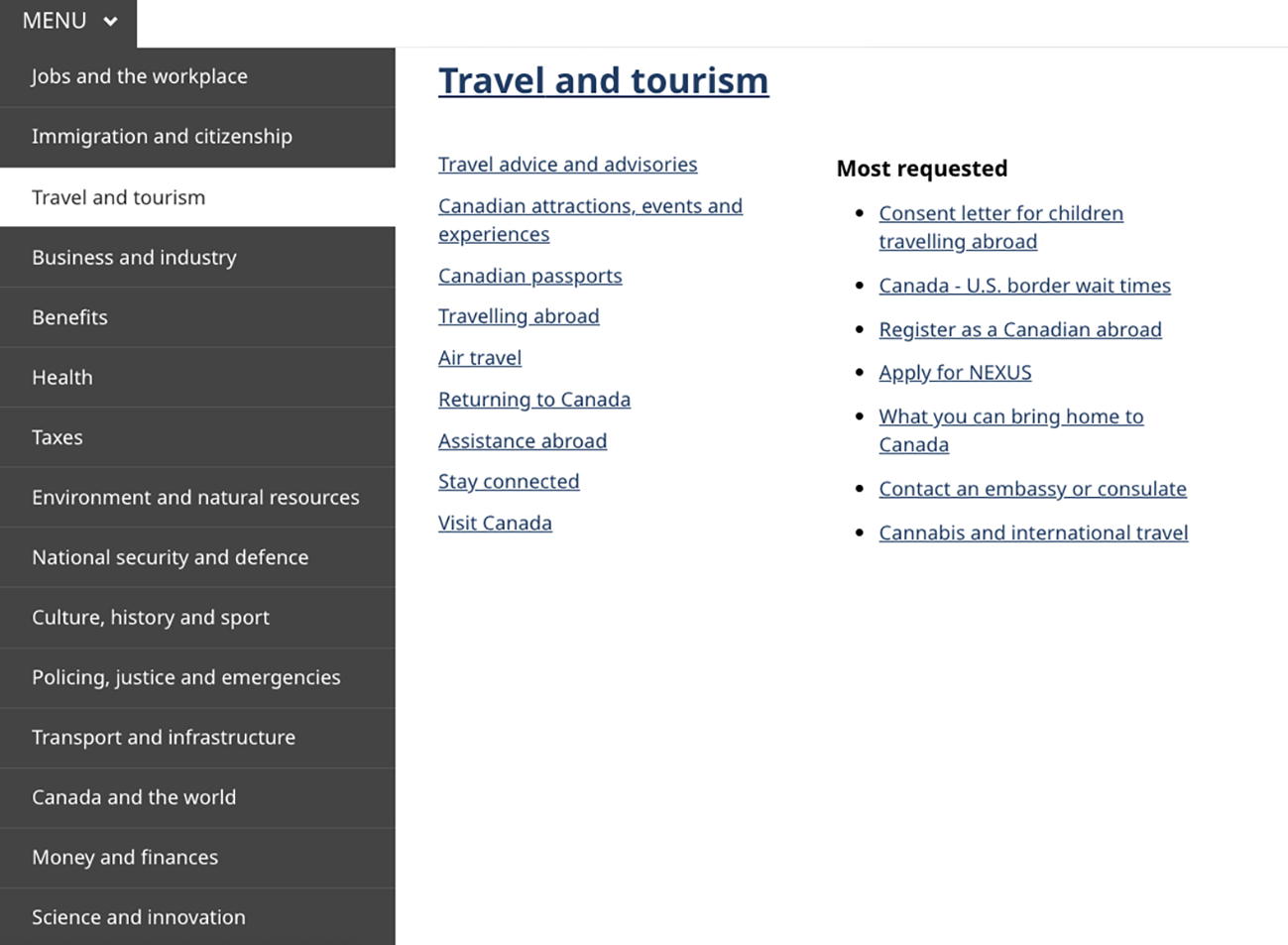
Image description: theme and topic menu with flyout open - large screen
The theme and topic menu consists of a button with the word "Menu" and a downward-facing chevron. When clicked, it expands to a menu that exposes the titles of all 16 themes. When the title of a theme is clicked a menu flyout appears on the right-hand side of the theme menu. The theme title is featured prominently at the top of the flyout while the main topics are listed below the title on the left-hand side. On the right-hand side of the flyout there is a "Most requested" heading followed by a list of the most requested tasks.
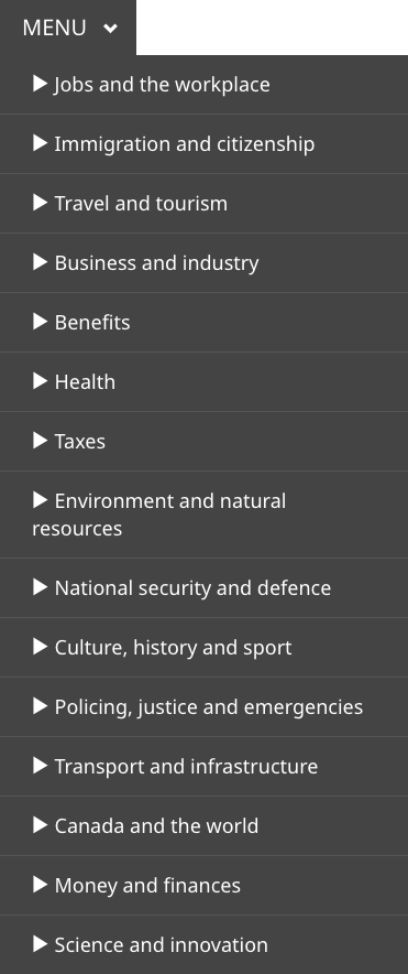
Image description: theme and topic menu - small screen
The theme and topic menu consists of a button with the word "Menu" and a downward-facing chevron. When clicked, it expands to a menu that exposes the titles of all 16 themes. When the title of a theme is clicked a menu flyout appears on the right-hand side of the theme menu. The theme title is featured prominently at the top of the flyout while the main topics are listed below the title on the left-hand side. On the right-hand side of the flyout there is a "Most requested" heading followed by a list of the most requested tasks.
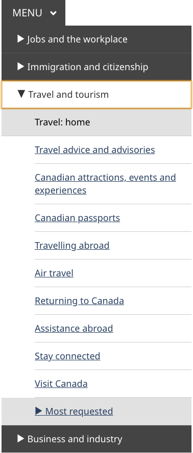
Image description: theme and topic submenu open – small screen
The theme and topic menu consists of a button with the word "Menu" and a downward-facing chevron. When clicked, it expands to a menu that exposes all themes. The "Travel and tourism" theme is expanded. It has a downwards-facing chevron to the left of the title "Travel and tourism". Below that title is a box with the words "Travel: home". Below that are links to the other topics within the theme. At the end of the expanded menu is another box with a sideways-facing chevron and a "Most requested" heading.
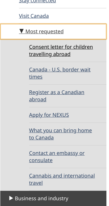
Image description: theme and topic menu with most requested submenu open - small screen
The "Most requested" menu is expanded. It has a downwards-facing chevron to the left of the words "Most requested". Underneath this heading are links to the 7 most requested pages for that theme.
How to implement
Find working examples and code for implementing the theme and topic menu.
GCweb (WET) theme implementation reference
The implementation reference includes how to configure each element of the header.
Implementations
Determine what best suits the type of page you're creating. Refer to your implementation's guidance if you want to exclude breadcrumbs.
GC-AEM
For the Government of Canada Adobe Experience Manager (AEM):
CDTS
For the Centrally Deployed Templates Solution (CDTS):
Research and rationale
Consult research findings and policy rationale.
Research findings
-
Canada.ca is a trusted source
Explains the decision to use “Canada.ca” as the label for the first link in the breadcrumb -
Wayfinding on Canada.ca research summary
Research showing that people navigating on the site use breadcrumb links nearly twice as often as they use the Theme and topic menu
Policy rationale
The spacing specifications for the breadcrumb links are designed so that touch targets meet WCAG AAA requirements.
As part of the global header, the breadcrumb is a mandatory element under the Canada.ca Specifications.
Latest changes
- Updated to include "Managing life events" as a theme
- Updated the guidance to include advice on what to avoid, content and design specifications, visual examples, implementation guidance, research findings and policy rationale
Page details
- Date modified: