
Contextual Sign in button: Canada.ca design
- Last updated: 2023-06-26
The Sign in button is an optional header element that directs people to government accounts that require authentication. It is a contextual and persistent call to action within a group of related pages.
On this page
When to use
Add the Sign in button when signing in to an account is a key task within a series of pages. This includes:
- pages where there is already a link or button to an account or accounts
- a set of pages that support a specific service (such as Employment insurance, GST)
- pages where analytics show people are using the menu or the search bar to access an account
You can use the Sign in button in addition to a supertask button on the same page. If you have an existing super task button, don't remove it. Instead, add the Sign in button. You may see changes in use over time in your analytics that show that you can remove the super task button.
What to avoid
- Use Sign in, not Log in
- Exclude the Sign in button from:
- account-chooser pages or sign-in process pages
- pages that aren't related to the authenticated service
Content and design
Find content and design specifications and visual examples.
Content specifications
Use “Sign in” as the label
- Small screens: total of 12 characters including spaces (no additional descriptive text)
- Large/medium screens: total of 25 characters including spaces (for additional descriptive text if needed, such as “Sign in to [account name]”)
Interactions
Link the Sign in button directly to the page where you begin your sign-in process, or to an account-chooser page with the different accounts you can sign in to.
Design specifications
Button structure
- Border:
- weight: 1px
- style: solid
- radius: 0
- Font:
- weight: 400
- family: Lato
- size: 16px
- colour: #fff
- Margin:
- top margin: 5px
- other margins: 0px
- Padding:
- top: 10px
- bottom: 10px
- left: 14px
- right: 14px
Default state
- background colour: #26374a
- border colour: #26374a
Hover state
- background colour: #444
- border colour: #444
Visual examples
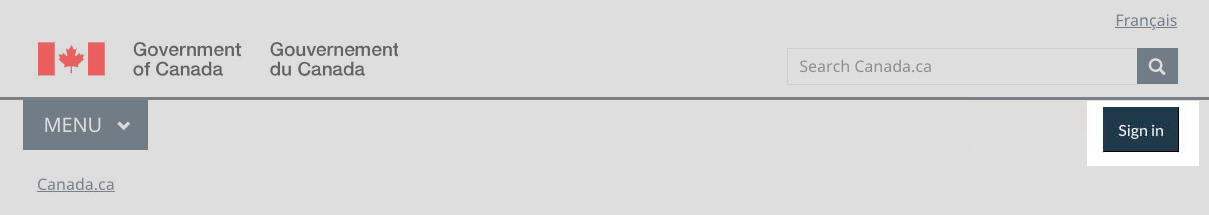
Image description: Contextual Sign in button - large screen
Standard header of an English Canada.ca page with the Sign in button highlighted
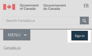
Image description: Contextual Sign in button - small screen
Standard header of an English Canada.ca page with the Sign in button highlighted
How to implement
Find working examples and code for implementing the Sign in button.
GCweb (WET) theme implementation reference
The implementation reference includes how to configure each element of the header.
Implementations
Determine what best suits the type of page you're creating.
GC-AEM
For the Government of Canada Adobe Experience Manager (AEM):
Research and rationale
We introduced the contextual sign in button to improve findability for this top task.
Latest changes
- Updated the guidance to include advice on what to avoid, content and design specifications, visual examples, implementation guidance, and policy rationale
- Expanded Sign in button guidance
Page details
- Date modified: