
Global footer: Canada.ca design
Last updated: 2025-06-19
Mandatory
The global (site-wide) footer at the bottom of each web page contains up to 3 bands:
- Contextual band
- Main band
- Sub-footer band
2022 design update: We’ve recently updated this pattern as part of a new navigation strategy coming out of the Wayfinding research project. To find out more about this project, visit the Research and rationale section on this page.
See Content footer pattern for guidance on how to apply the Date modified or GC Feedback components.
On this page
When to use
The footer acts as a rescue for people. They check it if they don't find what they want in the main content of the page.
Each element of the global footer provides direct, centralized access to specific types of content (for example, Contacts, Departments and agencies, Privacy).
Determine which footer elements to use based on the type of page you’re creating.
Standard pages
Standard pages are pages where people can navigate away without losing data, triggering errors or terminating their session.
Global footer requirements for a standard page
| Footer element | Mandatory |
|---|---|
| 1. Contextual band | Optional |
| 2. Main band | Mandatory |
| 3. Sub-footer band with Canada wordmark | Mandatory |
Transactional pages
Transactional pages are pages with an interaction task where people might lose data, trigger errors, or terminate their session if they navigate away from the page.
Global footer requirements for a transactional page
| Footer element | Mandatory |
|---|---|
| 1. Contextual band | Optional |
| 2. Main band | Optional |
| 3. Sub-footer band with Canada wordmark | Mandatory |
Campaign pages
Campaign pages are landing pages for external marketing or advertising campaigns. The flexibility in layout allows institutions to include elements of their external campaign in the page.
Global footer requirements for a campaign page
| Footer element | Mandatory |
|---|---|
| 1. Contextual band | Optional |
| 2. Main band | Optional |
| 3. Sub-footer band with Canada wordmark | Mandatory |
What to avoid
Don’t customize the mandatory elements of the global footer, beyond what is recommended in the guidance for each. Consistency in this space is essential for building brand awareness and user trust.
For example, the Canada wordmark should always appear in the lower right corner and the links in the main band should never change.
Content and design
Find detailed content and design specifications for each element of the footer:
Visual examples
Standard pages
Text version
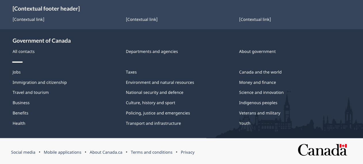
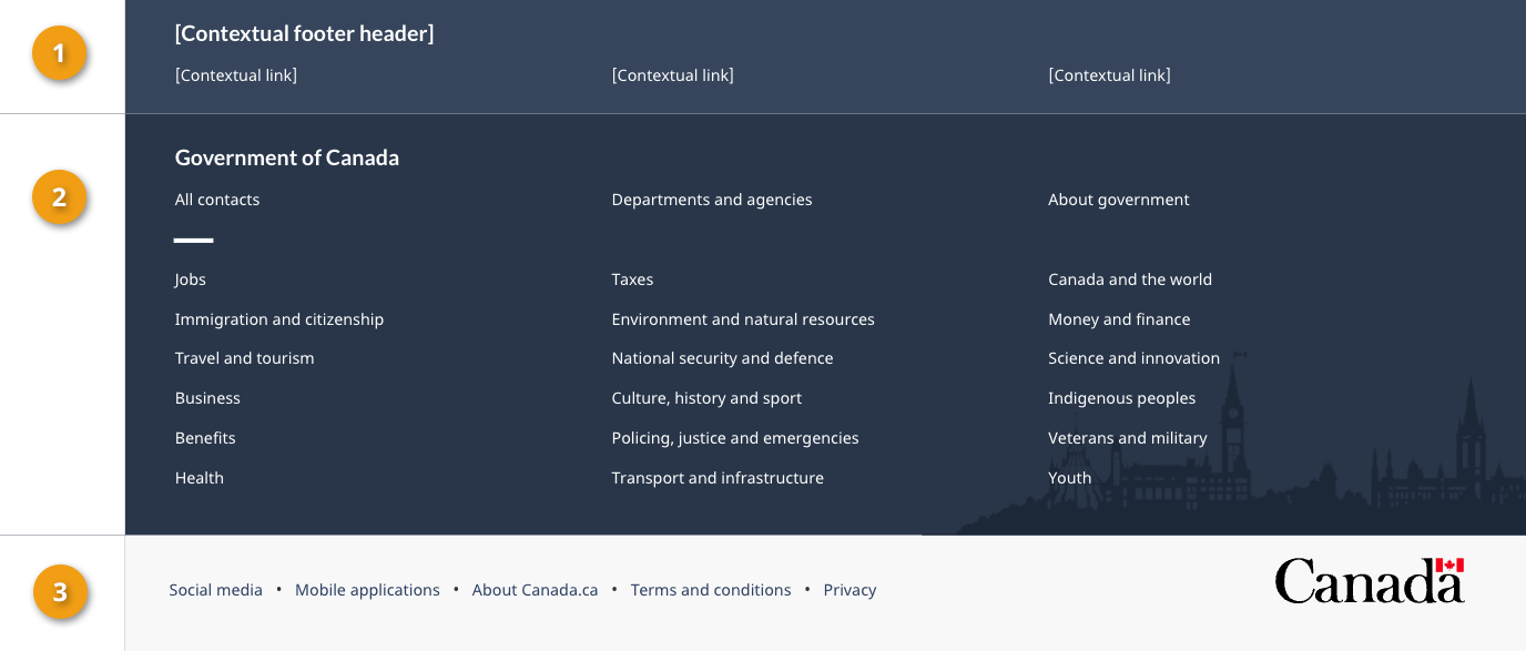
On large screens the global footer includes 3 distinct bands of links. The first is the contextual band. It contains a title and 3 contextual links in a single row. The second is the main band. It’s arranged in 3 columns and contains links to “All contacts,” “Departments and agencies,” and “About government.” There is a small decorative line as a break before continuing with links to all themes and audiences. The sub-footer is at the bottom and contains links to “Social media,” “Mobile applications,” “About Canada.ca,” “Terms and conditions,” and “Privacy.” These are all aligned to the left in a single row. It also includes the Canada wordmark in the same row, aligned to the right.
Text version
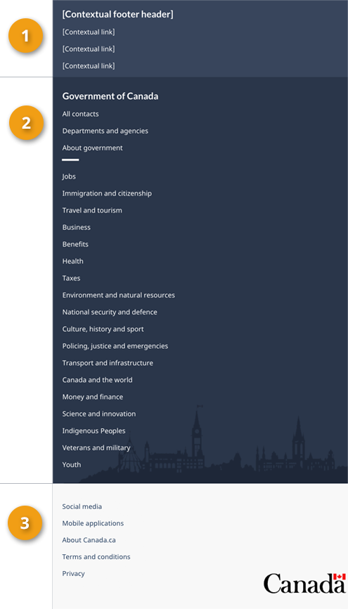
On small screens the global footer includes 3 distinct bands of links. The first is the contextual band. It contains a title and 3 contextual links in a single column. The second is the main band. It’s arranged in a single column and contains links to “All contacts,” “Departments and agencies,” and “About government.” There is a small decorative line as a break before continuing with links to all themes and audiences. The sub-footer is at the bottom and contains links to “Social media,” “Mobile applications,” “About Canada.ca,” “Terms and conditions,” and “Privacy,” arranged in 2 columns. Below these links is a final row with a “Top of page” link aligned to the left and the Canada wordmark aligned to the right.
Transactional and campaign pages

Text version
On large screens, the minimum global footer for transactional and campaign pages includes only the sub-footer band with links to “Terms and conditions” and “Privacy.” These are aligned to the left in a single row. It also includes the Canada wordmark in the same row, aligned to the right.

Text version
On small screens, the minimum global footer for transactional and campaign pages includes only the sub-footer band, with links to “Terms and conditions” and “Privacy.” Below these links is a final row with a “Top of page” link, aligned to the left and the Canada wordmark aligned to the right.
How to implement
GCweb (WET) theme implementation reference
Default
Alternate options for standard pages
Alternate options for transactional or campaign pages
Implementations
Determine the footer configuration that best suits your needs for the type of page you're creating. Refer to your implementation's guidance to customize the contextual band or sub-footer band links.
GC-AEM
For the Government of Canada Adobe Experience Manager (AEM):
CDTS
For the Centrally Deployed Templates Solution (CDTS):
Drupal
For Drupal:
2023 footer update:
Research and rationale
We updated the global footer for Canada.ca to align with a new overall navigation strategy that came out of the Wayfinding research project.
- Wayfinding on Canada.ca research summary
This summary explains the context of the research and the insights that drove the design updates. - Wayfinding research project improves our approach to navigation on Canada.ca
This blog post explains the changes that are being made to the Canada.ca design, and how they are being implemented.
Latest changes
- Updated typography specifications in tandem with alignment activities for GCWeb and GC Design System
- Added links to GC-AEM, CDTS and Drupal WxT implementation guidance
- Added links to the research summary and blog post for the Wayfinding project
- Updated pattern to reflect design changes from the Wayfinding project, moved detailed specifications to sub pages specific to individual bands
Page details
- Date modified: