
Buttons: Canada.ca design
- Last updated: 2022-09-23
Buttons are clickable objects intended to encourage a person to take action.
On this page
When to use
Use the button pattern to execute actions or commands that will change the system state at the front or back end, for example “Add comment,” “Submit,” “Send.”
Use buttons when:
- helping a person into or through a transaction such as “Sign in”
- invoking functionality, for example “Share this page”
- providing a persistent set of UI controls across a series of pages, for example “previous”, “next”, or “back to table of contents”
What to avoid
Do not use buttons when an ordinary text link will do the job just as well, like when providing a single, simple link to another page.
Use buttons to activate system controls, or to draw attention to primary actions on the page. Limit their use to prevent their visual impact from being reduced by overuse.
How to implement
Use the right type of button:
1. Supertask button
When to use: Use a supertask button to launch the main task or next step that people are trying to complete from a specific page, such as:
- apply for a program or service
- launch a calculator
- start a wizard
- find a clinic
You can also use it on the Institutional landing page , when there is evidence that a particular top task (a supertask) is clearly the most important.
What to avoid: Don’t use a supertask button to promote something that is not the primary task people are looking for on that page. For promotions, use Context-specific features or Promotional feature banner .
Don't use supertask buttons more than once on a page.
Code
<button class="btn btn-call-to-action">Calculate how much you can get</button>2. Primary button
When to use: Use primary buttons for actions someone is likely to take on that page, such as the next or submit buttons in a form.
What to avoid: Don't use more than one primary button on a page.
Code
<button class="btn btn-primary">Submit</button>3. Secondary button
When to use: Use secondary buttons for alternative, less important or less likely to be used options, such as the 'previous' button in a form.
Code
<button class="btn btn-default">Previous</button>4. Danger button
When to use: Use danger buttons to bring attention to an action that might have consequences, such as deleting a form or leaving an authenticated application.
What to avoid: Don't use danger buttons unless they are absolutely needed.
Code
<button class="btn btn-danger">Erase form</button>5. Link button
When to use: Use link buttons for infrequently used options, such as for restarting a wizard or calculator. Link buttons have a slightly larger target area than regular links.
Code
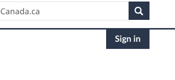
<button class="btn btn-link">Restart calculator</button>6. Contextual Sign in button
When to use: The contextual Sign in button is an optional element of the Global header . Use it on pages where signing in to an account is an important task. Use the label "Sign in".
Customizing buttons
| Option | Description | How to use |
|---|---|---|
| Full width | Make a button occupy the full width of its column. | Add the class btn-block to button. |
| Grouped buttons | Group buttons side by side for controls such as a toggle. | Surround the grouped buttons with a div with the class btn-group . |
| Change sizing | Resize buttons if you need to improve visibility of a call to action or to save space in designs such as a toggle. | Apply the following classes to the button:
|
| Disable button | Grey out a button so it can't be clicked on. Generally, try to remove the button instead of disabling it. | Add the class disabled to button. |
Research and blog posts
Latest changes
- Expanded Sign in button guidance
- Added a new beta version of a contextual Sign in button
Page details
- Date modified: