Context-specific features: Canada.ca design
Last updated: 2024-04-03
The context-specific features pattern includes an image along with a link and a description for promoting government activities, initiatives, programs and services.
On this page
When to use
Use feature tiles for promotions that are contextually related to the page.
What to avoid
Don't use this pattern to promote unrelated content or content that doesn’t fit the context of the page.
Don’t use this pattern when it may distract from the task flow.
Content and design
Find content and design specifications and visual examples.
Content specifications
Position context-specific feature tiles after the main content of the page, but before the footer section.
Use a maximum of 3 features on a page.
Always use a heading for this block:
-
Multiple features:
- The default heading is “Features” in English and “En vedette” in French
- You can use a more specific heading to provide stronger context
-
Single feature:
- You can make the heading invisible so that it feels more integrated with the content
- If the heading is visible, it’s better to use a more specific heading to provide stronger context
-
Include an image, a linked title, and a description in each feature:
- Keep the title to approximately 40 characters
- Keep the description text short and concise, ideally 1 or 2 lines, or below 145 characters
Design specifications
-
Text uses standard Canada.ca styles:
- Typography
- Colours
- Code the heading as an H2 but style it as an H3
- Code the linked title as an H5
-
Layout for multiple features:
- Image should appear first, followed by hyperlinked title and then description
- Image dimensions are 360px x 203px
- News items is coded as an unstyled list
-
Enclose the feature within a grey container:
- background colour: #f5f5f5
- border: 1px solid #e3e3e3
- border radius: 4px
- bottom margin: 20px
-
box shadow:
- blur radius: 1px
- colour: black with 5% opacity
- offset x: 0
- offset y: 1px
- type: inset
- minimum height: 20px
- padding: 19px
-
Layout for single features:
- Place the image on the left, with the hyperlinked title and description to the right of the image
- Image dimensions are 360px x 203px
-
Apply a 5px grey border to the image
- background: #eaebed
- border colour: #eee
- border radius: 0
- padding: 5px
Interactions
Hyperlink the entire container of the featured element:
- Image
- Hyperlinked title
- Description
Visual examples

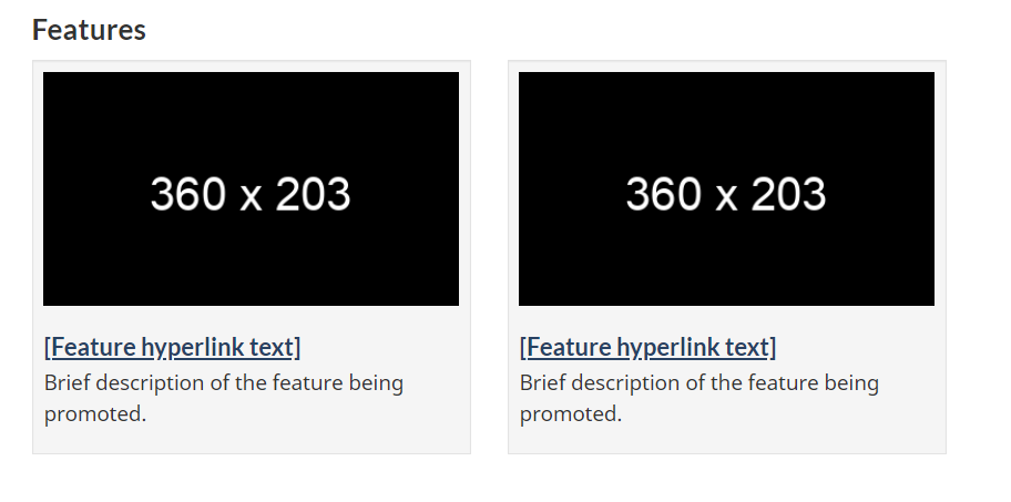
Image description: context-specific features - large screen
A heading titled “Features” is followed by two feature placeholders in a horizontal row. Each has an image placeholder surrounded by a light grey background. Within the image placeholder are the prescribed image dimensions: 360px x 203px. Below each image placeholder on the grey background is a placeholder hyperlink that reads [Feature hyperlink text]. Underneath is the following placeholder text: Brief description of the feature being promoted.
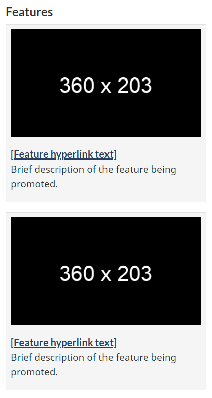
Image description: context-specific features - small screen
A heading titled “Features” is followed by two feature placeholders in a vertical row. Each has an image placeholder surrounded by a light grey background. Within the image placeholder are the prescribed image dimensions: 360px x 203px. Below each image placeholder on the grey background is a placeholder hyperlink that reads [Feature hyperlink text]. Underneath is the following placeholder text: Brief description of the feature being promoted.
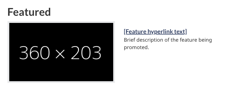
Image description: single context-specific feature - large screen
A heading titled “Featured” is followed by one feature placeholder. The image placeholder is on the left side and is surrounded by a light grey background. Within the image placeholder are the prescribed image dimensions: 360px x 203px. To the right of the image placeholder is a placeholder hyperlink that reads [Feature hyperlink text]. Underneath is the following placeholder text: Brief description of the feature being promoted.
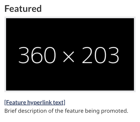
Image description: single context-specific features - small screen
A heading titled “Featured” is followed by one feature placeholder. The image placeholder is above the text and is surrounded by a light grey background. Within the image placeholder are the prescribed image dimensions: 360px x 203px. Below the image placeholder is a placeholder hyperlink that reads [Feature hyperlink text]. Underneath is the following placeholder text: Brief description of the feature being promoted.
How to implement
Find working examples and code for implementing the context-specific features pattern.
GCweb (WET) theme implementation reference
Implementations
Determine what best suits the type of page you're creating.
GC-AEM
For the Government of Canada Adobe Experience Manager (AEM):
Research and rationale
Consult research findings and policy rationale.
Research findings
Less is more. Research on improving promotions on Canada.ca shows that features are the most effective when they’re relevant to the content on the page. A single feature tile works best, but keep the number to a minimum if you plan to use more than one.
Policy rationale
This is an optional pattern for the following mandatory templates:
Latest changes
- Updated the guidance to include content and design specifications, visual examples and implementation guidance
Page details
- Date modified: