Introduction block: Canada.ca design
Last updated: 2024-09-24
The introduction block pattern introduces the content of a landing page.

On this page
When to use
The introduction block pattern is a mandatory element for institutional landing pages and topic pages. It’s optional for other landing pages.
What to avoid
Don’t use this on destination pages when people are trying to complete a task.
Don’t use the full-width image on topic pages, use a half-width image.
Content and design
Find content and design specifications and visual examples.
Content specifications
The introduction block pattern consists of:
It can also include:
Title
The page title should be descriptive and unique, but brief.
Don’t use acronyms or abbreviations in the title.
Short description
Keep the text short and concise, 1 or 2 lines is ideal.
- approximately 145 characters with spaces
Write in plain language.
Image
Only use decorative images because the image is hidden on small screens.
Don't apply a link to the image, use the featured link pattern instead.
Limit use of text in images.
- Consult the Canada.ca Style Guide for further guidance on images.
Supertask button
Only include a supertask button if there’s a specific task that has at least 1/3 of the clickthrough rate from the page.
Find out how to use a supertask button:
Design specifications
-
Title and short description
- The title is an H1 and the short description uses body text
- Use standard typography styles
-
Full-width background image
- 1200px by 726px
- Image ratio: 1.65:1
- Visible on large screens, but hidden on medium and small screens
- Treated as a background image:
- default design has the image positioned to the right, with a gradient fading out 50% of the image
-
Half-width image
- 520px by 200px
- Visible on large screens, but hidden on medium and small screens
- Positioned to the right
- Supertask button
Accessibility
- If you’re superimposing text over an image, ensure there’s a contrast ratio of at least 4.5:1.
Visual examples

Image description: introduction block - large screen
The introduction block appears below the global header and the Canada.ca breadcrumb. It consists of an h1 for Institution name and a short description of the institution’s mandate. This visual example does not include the optional image and supertask button.

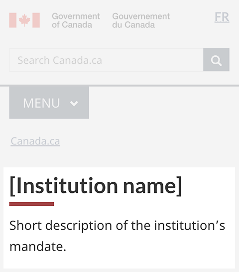
Image description: introduction block - small screen
The introduction block appears below the global header and the Canada.ca breadcrumb. It consists of an h1 for Institution name and a short description of the institution’s mandate. This visual example does not include the optional image and supertask button.

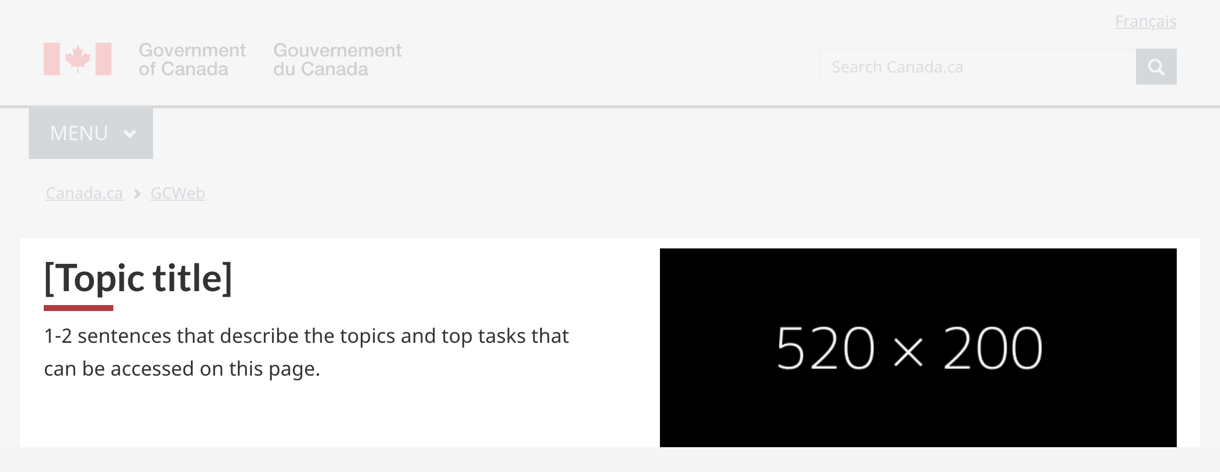
Image description: introduction block with half-width image - large screen
The introduction block appears below the global header and the Canada.ca breadcrumb. It consists of an h1 for the topic title and a short description that describes the topics and top tasks that can be accessed on the page. It also includes a half-width image that is 520px by 200px positioned to the right of the h1 and description.
How to implement
Find working examples and code for implementing the introduction block pattern.
GCweb (WET) theme implementation reference
The implementation reference includes how to configure elements of the design system.
Implementations
Determine what best suits the type of page you're creating.
GC-AEM
For the Government of Canada Adobe Experience Manager (AEM):
Research and rationale
Consult research findings and policy rationale.
Research findings
Research summary: Contact the CRA
Canada Revenue Agency and DTO developed the introduction block as part of the optimization project for CRA contacts.
We found the introduction block design to be useful on institutional landing pages, especially in situations where a supertask button is needed. Check the research summary for additional information about other aspects of the project.
Policy rationale
The introduction block pattern is required in the following mandatory templates:
Latest changes
- Updated the guidance to include the half-width image
- Updated the guidance to include content and design specifications, visual examples and implementation guidance
Page details
- Date modified: