Canada Child Benefit: Research summary
The Canada Child Benefit (CCB) contributes to reducing child poverty in Canada. In early 2019, the Canada.ca Experience Office (CEO) partnered with the Canada Revenue Agency (CRA) to redesign the Canada Child Benefit pages on Canada.ca. The team’s goal was to reduce calls to the call centre for key questions. After the redesigned pages went live in 2020, the CRA call centre confirmed that call rates had indeed dropped.
To meet the needs of parents on mobile phones, the team co-designed a new pattern we called the subway navigation. The existing design was broken into steps, but wasn’t effective on phone screens. The new design’s visual representation of the links resembles the stops on a subway map.
This research summary explains the context of the research project in which the subway navigation pattern was created and all the considerations that were taken into account. It also highlights other innovations from this project.
Subway navigation has proven to be an effective pattern to lead users through a service that involves several steps. Analytics and usability testing have shown that it keeps users ‘on track’ with improved findability and success rates. The CRA later adopted and extended the pattern for the successful Canada Emergency Response Benefit (CERB) and Canada Recovery Benefits pages.
By understanding when and how to use subway navigation, you can use this powerful pattern correctly.
Establishing a baseline
In 2019, the Canada Revenue Agency (CRA) sought to reduce calls from Canadians who couldn’t find or understand the web content that explains how to receive or maintain their child benefits. The Canada.ca Experience Office (CEO) partnered with CRA to work on this top task.
The first step was to conduct workshops with stakeholders, including call centre staff. The intent of the workshops was to understand the top call drivers.
The team used call centre data to characterize common issues. They then generated an extensive set of real-world scenarios that reflected the problems and contexts that drove the highest volume of calls. They used this data to create testing scenarios for baseline and comparison tests.
Top call-drivers included:
- Why do people miss payments (25%)
- How much will I get (12%)
- Apply for CCB (10.5%)
- Debt/amount owing (4.3%)
The team selected a set of these scenarios to establish a baseline measurement. 20 Canadian parents on phones attempted the scenarios in a moderated usability performance study. The overall success rate was 28% across 7 task scenarios. An additional 5 scenarios were tested but fewer than 16 participants completed them so they weren’t included in the overall success score.
Task scenarios in baseline
| Task | Scenario |
|---|---|
| Payments stopped | You didn't get your usual child benefit payment in May/July. Which of the reasons below would cause payments to stop? |
| Calculate payment | Mart's second child was just born. How much Canada Child Benefit will Mart get every month? - Mart lives in Quebec, single with sole custody. 1st child is 2 years old - Made $60,000 last year - Will be on leave for next 12 months so will only make $30,000. |
| Payment date | Baseline: Exactly which day in July will your Canada Child Benefit payment be deposited? Optimization: Exactly which day in December will your Canada Child Benefit payment be deposited? |
| Share custody percentage | Peter's kids are living with his ex. They will start coming to stay with Peter for 2 weekends per month. Should he apply for the Canada Child Benefit? |
| Shared custody percentage | If you were separated and sharing custody, could the two of you choose what percentage of the Canada Child Benefit each of you will get? |
| Payment less in July | Petra's July Child Benefit payment arrived and it is much less than she received in June. What is the most likely reason for this change? |
| Direct deposit change within a month | Is it safe to close your old bank account before your June 20th Child Benefit payment? You changed your direct deposit to a new bank account number on June 5th. |
The most common problems were not finding the page that held the answer (32% of participants had that problem) or not being able to determine the correct answer from the information on the page (for example mixing eligibility with entitlement).
Design solutions
The team focused on prototyping a design that would solve the problems observed in the baseline test. The existing pages used the service initiation template with the ordered multi-page navigation pattern. Parents on phones couldn’t use the multi-page navigation effectively.
It took up too much of the screen, and didn’t convey the grouped nature of the pages. Some parents thought the page sets were “On this page” options. They also tended to avoid the Overview page.
The team replaced the multi-page navigation pattern with the new subway navigation pattern. The subway pattern differentiates sections in a tighter space and conveys the connections.
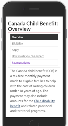
Image description: Canada Child Benefit previous multi-page navigation
The old service initiation template with ordered multi-page navigation had links to other pages listed in individual boxes at the top of the page. The content of the selected page appeared below, which gave the impression that the links were "On this page" links and not links to related pages with further information.
The subway navigation pattern
Subway navigation includes:
- An index page leading to all the steps
- Step pages that include links to the other steps
- Descriptive headings focused on answers
Both the index page and the step pages use a visual representation of the links between steps that resembles a subway map.
New index page
In the subway navigation pattern, an index page replaces the Overview page. It has a title, brief description, and a step graphic that matches the subway steps menu. It provides an easy-to-scan landing page for the service that outlines each step. Landing pages help with both search engine optimization and support the information architecture. Users can navigate back to the index page through the breadcrumb.
Step pages
In the original Service initiation template with the multi-page navigation pattern, people had problems navigating between pages, often selecting the button for the page they were already on. The Subway pattern makes the steps clearer without repeating the title. It also positions the "On this page" pattern after the subway links. On desktop, the subway links appear on the right of the screen.
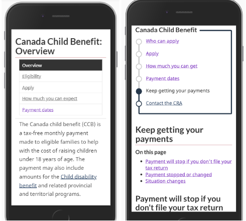
Image description: Canada Child Benefit old and new navigation templates
(First image) Previous multi-page navigation. (Second image) Subway navigation clearly differentiates the step pages from the “On this page” links. The title of the page “Keep getting your payments” appears below the subway links.
New descriptive headings focused on answers
In the Service initiation template with the multi-page navigation, page titles appear as buttons with no space for description. Word wrapping throws off the alignment, so content designers often limit the number of words to control the size of the buttons. In the baseline study, this made it harder for people to choose between the buttons because the labels weren’t clear enough.

Image description: Canada Child Benefit navigation menu
Screenshot of a navigation menu. The heading is Canada Child Benefit: Overview. The navigation options are Overview, Eligibility, Apply, How much can you expect, Payment dates
In the subway pattern, the link text can be longer. The index page has space for a description below each link.
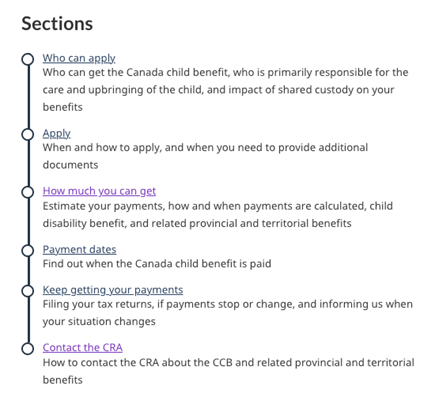
Image description: Canada Child Benefit subway pattern
Desktop view of the index page for CCB with each step page listed. The titles for each step page address common call center questions. They include Who can apply, Apply, How much you can get, Payment dates, Keep getting your payments, Contact the CRA. Under each title is a short description describing what users can find on the page.
Content design solutions
The optimization project included many other successful changes focused on answers over information. Use of subway navigation was complemented by:
- integrating content from publications
- rewriting headings with answer keywords in plain language
- reducing complexity with choices
- removing disclaimer barriers
- removing duplicated content
Removing publications
The answers users are looking for should be integrated into the grouped page content. In the baseline test, some answers about custody were in a PDF booklet that some participants refused to open on their phones. In the comparison study, we incorporated the booklet answers directly into the step pages used in the subway navigation. This integration ensured that both custody tasks reached 100% success, compared to baseline rates below 50%.
Rewriting headings with answer keywords in plain language
We redesigned page titles and headings to answer top user questions. For instance, baseline participants looked under “Apply” to know “who can apply” as well as “how to keep being eligible”. The subway design had separate page titles for each of the answers.
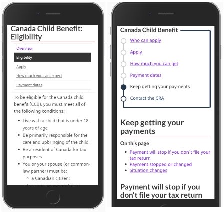
Image description: previous and new design for Canada Child Benefit with adjusted page titles
The old design included the following pages: Overview, Eligibility, Apply, How much you can expect and Payment dates. The new design adjusted the page titles to match what people look for: Who can apply, Apply, How much you can get, Payment dates, Keep getting your payments, Contact the CRA
Reducing complexity with choices
The original pages had few headings buried in long blocks of text that covered every situation. People struggled to find answers on their phones.
In the comparison study, the team used the expand collapse pattern to collapse answers that applied to only specific groups of people. This approach was very successful at shortening the pages, and helping people choose the right answer for their situation.
Removing disclaimer barriers
On the live site, a long disclaimer blocked access to an important benefit calculator tool, with an ‘I accept’ button below to launch it. Participants failed to scroll past the disclaimer to the button, and some who did find the button hesitated to choose “accept”. The team moved the disclaimers to the answer phase in the tool, where they were relevant, and removed the ‘I accept’ step.
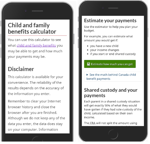
Image description: Canada Child Benefit disclaimer removal
On the first screenshot, the old design displays the disclaimer first, which takes up the whole screen on mobile and hides the calculator. On the second screenshot, the new design uses a green super task button to draw attention to the calculator. The disclaimer isn't part of this page, so it doesn't get in the way.
Measuring outcomes
The overall task success went up from 28% to 83% when DTO retested the task scenarios on the prototype. This prompted CRA to move quickly to change the live pages to reflect the new design.
Call volumes dropped: the redesigned pages went live in December 2019. In Q1 of 2020, calls for CCB asking “how much will my payment be” dropped by more than 50%. In contrast, calls for the same question for the GST credit - without redesigned pages - didn’t drop during the same period.
Calculator use increased: use of the Benefits calculator doubled after the page name changed to “How much can I get” and the calculator was highlighted with a green button. From April to June 2020, visits to the English benefits calculator page were almost double what they were in 2019 (609,703 in 2020 compared to 341,492 in 2019). Visits to the French page increased by more than a third (118,956 in 2020 compared with 76,124 in 2019).
What we learned
Involve the call centre in optimization projects. To achieve the outcome of reducing calls, collaborating with the call centre team was essential. Know your top call drivers, and frame the content to answer those questions, rather than simply providing all the information for people to find the answers themselves.
Design for mobile users. For high-mobile services, the subway pattern is a substantial improvement over the multi-page tab navigation. It breaks up unique steps into pages that clearly convey the steps and journey on a phone.
The subway pattern has improved navigation for many services at CRA. It started with the Canada Child Benefit and was also widely used to communicate COVID benefits during the pandemic. CRA has continued doing usability testing and has continued to improve the design on new benefits pages.
Other departments have started to use the subway pattern for its usefulness and flexibility. Before using the pattern, it’s important to know when to use it and how to prepare the content to work well with the pattern.
Explore further
- Subway navigation pattern
- Service initiation pages template
- Ordered multi-page navigation
- Used to provide an outline of content that spans multiple pages and has a default or preferred order
Page details
- Date modified: