Subway navigation: Canada.ca design system

  • Beta
  • Last updated: 2023-07-12

Break up long and complex content into pages that each focus on a step or specific answer people need before moving to the next step or section. Ideal for presenting services and processes.

On this page

When to use

Use to group related task pages together and provide navigation between these pages.

Keep the number of pages tied together to a reasonable number (ideally 6 or less, maximum 8).

What to avoid

Don't use numbers when you use this pattern for sequenced steps. Testing has shown that Canadians are less likely to get to the section they need if the elements are numbered.

How to implement

This pattern is still in beta, and the code is still under review. Use it sparingly, as it may still be subject to change.

You will need to use provisional CSS to use this design pattern.

  1. Index page
  2. Step page

1. Index page

When to use: use as the landing page for a set of related pages that use the subway navigation.
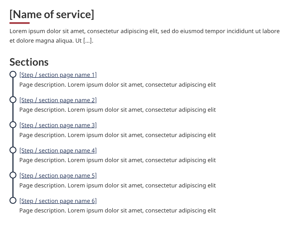
Code
HTML
<h1 property="name" id="wb-cont" class="gc-thickline">[Name of service]</h1>
<p>Lorem ipsum dolor sit amet, consectetur adipiscing elit, sed do eiusmod tempor incididunt ut labore et dolore magna aliqua. Ut [...].</p>
<nav class="provisional gc-subway">
	<h2>Sections</h2>
	<dl>
		<dt>
			<a href="gc-subway-en.html">[Step / section page name 1]</a>
		</dt>
		<dd>
			Page description. Lorem ipsum dolor sit amet, consectetur adipiscing elit
		</dd>
		<dt>
			<a href="page2-en.html">[Step / section page name 2]</a>
		</dt>
		<dd>
			Page description. Lorem ipsum dolor sit amet, consectetur adipiscing elit
		</dd>
		<dt>
			<a href="#">[Step / section page name 3]</a>
		</dt>
		<dd>
			Page description. Lorem ipsum dolor sit amet, consectetur adipiscing elit
		</dd>
		<dt>
			<a href="#">[Step / section page name 4]</a>
		</dt>
		<dd>
			Page description. Lorem ipsum dolor sit amet, consectetur adipiscing elit
		</dd>
		<dt>
			<a href="#">[Step / section page name 5]</a>
		</dt>
		<dd>
			Page description. Lorem ipsum dolor sit amet, consectetur adipiscing elit
		</dd>
		<dt>
			<a href="#">[Step / section page name 6]</a>
		</dt>
		<dd>
			Page description. Lorem ipsum dolor sit amet, consectetur adipiscing elit
		</dd>
	</dl>
</nav>
CSS
.provisional.gc-subway {
	border-radius: 0px 6px 6px 0px;
	border-right: 4px solid #26374a;
	border-top: 4px solid #26374a;
	margin-top: 38px;
}
.provisional.gc-subway ul {
	clear: both;
	list-style: none;
	padding-left: .57em;
	padding-top: 10px;
	position: relative;
}
.provisional.gc-subway ul li {
	border-left: 4px solid #26374a;
	padding: 0px 20px 30px 1em;
}
.provisional.gc-subway ul li::first-line {
	line-height: 1 !important;
}
.provisional.gc-subway ul li :first-child::before {
	background-color: #fff;
	border: 3px solid #26374a;
	border-radius: 50%;
	content: "";
	height: 1.2em;
	left: .05em;
	position: absolute;
	-webkit-transition: width .2s, height .2s, left .2s, margin-top .2s;
	transition: width .2s, height .2s, left .2s, margin-top .2s;
	width: 1.2em;
}
.provisional.gc-subway ul li.active > :first-child::before {
	background-color: #26374a;
}
.provisional.gc-subway ul li a[href]:hover::before,
.provisional.gc-subway ul li a[href]:focus::before {
	height: 1.4em;
	left: -.05em;
	margin-top: -.1em;
	width: 1.4em;
}
.provisional.gc-subway ul li:last-child {
	border-bottom: 4px solid #26374a;
	border-bottom-left-radius: 6px;
	border-left: 4px solid #26374a;
}
.provisional.gc-subway ul li ul {
	margin-top: 20px;
	padding-left: .55em;
}
.provisional.gc-subway ul li ul li:last-child {
	border-bottom-width: 0px;
	padding-bottom: 0px;
}
.provisional.gc-subway ul li ul.noline li {
	-o-border-image: none;
	border-image: none;
	border-left: 4px solid transparent;
}
.provisional.gc-subway h1 {
	float: left;
}
.provisional.gc-subway h1,
.provisional.gc-subway-section .gc-subway-h1 {
	background-color: #fff;
	border-bottom-width: 0px;
	color: #555;
	font-size: 1.3em;
	margin-right: 20px;
	margin-top: -19px;
	padding: 0px 20px 10px 0px;
}
@media screen and (min-width: 992px) {
	.provisional.gc-subway {
		border-right: 0;
		border-top: 0;
		display: none;
		margin-top: 25px;
		padding-left: 15px;
	}
	.provisional.gc-subway.no-blink {
		display: block;
	}
	.provisional.gc-subway .gc-subway-menu-nav {
		float: right;
		width: 33.33%;
	}
	.provisional.gc-subway ul li:last-child {
		border-bottom: 0;
		border-left: 4px solid transparent;
	}
	.provisional.gc-subway-section {
		padding-right: 15px;
		width: 66.66%;
	}
	.provisional.gc-subway-section .gc-subway-h1,
	.provisional.gc-subway-section h1 {
		margin-top: 0;
	}
	.provisional.gc-subway-section .gc-subway-h1 {
		font-family: Lato, sans-serif;
		font-weight: inherit;
		margin-bottom: 0;
		margin-right: 0;
		padding-bottom: 0 !important;
		padding-left: 0;
	}
	.wb-disable .provisional.gc-subway {
		display: block;
	}
}

2. Step page

When to use: Use on each page tied by the subway navigation.
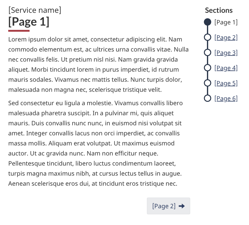
Code
HTML
<nav class="provisional gc-subway">
	<h1 id="gc-document-nav">[Service name]</h1>
	<ul>
		<li>
			<a href="#" class="active" aria-current="page">[Page 1]</a>
		</li>
		<li>
			<a href="#" class="hidden-xs hidden-sm">[Page 2]</a>
			<a href="#gc-document-nav" class="visible-xs visible-sm">[Page 2]</a>
		</li>
		<li>
			<a href="#" class="hidden-xs hidden-sm">[Page 3]</a>
			<a href="#gc-document-nav" class="visible-xs visible-sm">[Page 3]</a>
		</li>
		<li>
			<a href="#" class="hidden-xs hidden-sm">[Page 4]</a>
			<a href="#gc-document-nav" class="visible-xs visible-sm">[Page 4]</a>
		</li>
		<li>
			<a href="#" class="hidden-xs hidden-sm">[Page 5]</a>
			<a href="#gc-document-nav" class="visible-xs visible-sm">[Page 5]</a>
		</li>
		<li>
			<a href="#" class="hidden-xs hidden-sm">[Page 6]</a>
			<a href="#gc-document-nav" class="visible-xs visible-sm">[Page 6]</a>
		</li>
	</ul>
</nav>

<h1 property="name" id="wb-cont" class="gc-thickline">[Page 1]</h1>
<p>Lorem ipsum dolor sit amet, consectetur adipiscing elit. Nam commodo elementum est, ac ultrices urna convallis vitae. Nulla nec convallis felis. Ut pretium nisl nisi. Nam gravida gravida aliquet. Morbi tincidunt lorem in purus imperdiet, id rutrum mauris sodales. Vivamus nec mattis tellus. Nunc turpis dolor, malesuada non magna nec, scelerisque tristique velit.</p>
<p>Sed consectetur eu ligula a molestie. Vivamus convallis libero malesuada pharetra suscipit. In a pulvinar mi, quis aliquet mauris. Duis convallis nunc nunc, in euismod nisi volutpat sit amet. Integer convallis lacus non orci imperdiet, ac convallis massa mollis. Aliquam erat volutpat. Ut maximus euismod auctor. Ut ac gravida nunc. Nam non efficitur neque. Pellentesque tincidunt, libero luctus condimentum laoreet, turpis magna maximus nibh, at cursus lectus tellus in augue. Aenean scelerisque eros dui, at tincidunt eros tristique nec.</p>
<nav class="mrgn-bttm-lg mrgn-tp-lg">
	<h3 class="wb-inv">Document navigation</h3>
	<ul class="pager">
		<li class="next"><a href="#wb-cont" rel="next"><span class="wb-inv">Next: </span>[Page 2]</a></li>
	</ul>
</nav>
CSS
.provisional.gc-subway {
		border-radius: 0px 6px 6px 0px;
		border-right: 4px solid #26374a;
		border-top: 4px solid #26374a;
		margin-top: 38px;
	}
	.provisional.gc-subway ul {
		clear: both;
		list-style: none;
		padding-left: .57em;
		padding-top: 10px;
		position: relative;
	}
	.provisional.gc-subway ul li {
		border-left: 4px solid #26374a;
		padding: 0px 20px 30px 1em;
	}
	.provisional.gc-subway ul li::first-line {
		line-height: 1 !important;
	}
	.provisional.gc-subway ul li :first-child::before {
		background-color: #fff;
		border: 3px solid #26374a;
		border-radius: 50%;
		content: "";
		height: 1.2em;
		left: .05em;
		position: absolute;
		-webkit-transition: width .2s, height .2s, left .2s, margin-top .2s;
		transition: width .2s, height .2s, left .2s, margin-top .2s;
		width: 1.2em;
	}
	.provisional.gc-subway ul li.active > :first-child::before {
		background-color: #26374a;
	}
	.provisional.gc-subway ul li a[href]:hover::before,
	.provisional.gc-subway ul li a[href]:focus::before {
		height: 1.4em;
		left: -.05em;
		margin-top: -.1em;
		width: 1.4em;
	}
	.provisional.gc-subway ul li:last-child {
		border-bottom: 4px solid #26374a;
		border-bottom-left-radius: 6px;
		border-left: 4px solid #26374a;
	}
	.provisional.gc-subway ul li ul {
		margin-top: 20px;
		padding-left: .55em;
	}
	.provisional.gc-subway ul li ul li:last-child {
		border-bottom-width: 0px;
		padding-bottom: 0px;
	}
	.provisional.gc-subway ul li ul.noline li {
		-o-border-image: none;
		border-image: none;
		border-left: 4px solid transparent;
	}
	.provisional.gc-subway h1 {
		float: left;
	}
	.provisional.gc-subway h1,
	.provisional.gc-subway-section .gc-subway-h1 {
		background-color: #fff;
		border-bottom-width: 0px;
		color: #555;
		font-size: 1.3em;
		margin-right: 20px;
		margin-top: -19px;
		padding: 0px 20px 10px 0px;
	}
	@media screen and (min-width: 992px) {
		.provisional.gc-subway {
		border-right: 0;
		border-top: 0;
		display: none;
		margin-top: 25px;
		padding-left: 15px;
		}
		.provisional.gc-subway.no-blink {
		display: block;
		}
		.provisional.gc-subway .gc-subway-menu-nav {
		float: right;
		width: 33.33%;
		}
		.provisional.gc-subway ul li:last-child {
		border-bottom: 0;
		border-left: 4px solid transparent;
		}
		.provisional.gc-subway-section {
		padding-right: 15px;
		width: 66.66%;
		}
		.provisional.gc-subway-section .gc-subway-h1,
		.provisional.gc-subway-section h1 {
		margin-top: 0;
		}
		.provisional.gc-subway-section .gc-subway-h1 {
		font-family: Lato, sans-serif;
		font-weight: inherit;
		margin-bottom: 0;
		margin-right: 0;
		padding-bottom: 0 !important;
		padding-left: 0;
		}
		.wb-disable .provisional.gc-subway {
		display: block;
		}
	}
JS
( function( $, window, wb ) {
"use strict";

var $document = wb.doc,
	componentName = "gc-subway",
	selector = ".provisional." + componentName,
	initEvent = "wb-init ." + componentName,
	views = {
		xxs: "xxsmallview",
		xs: "xsmallview",
		sm: "smallview",
		md: "mediumview",
		lg: "largeview",
		xl: "xlargeview"
	},
	mainClass = "gc-subway-section",
	toggleClass = "wb-inv",
	desktopInited = false,
	skipLink = false,
	$html = wb.html,
	$h1, $h2, $h1Copy, $menu, $main,

	/**
	 * @method init
	 * @param {jQuery Event} event Event that triggered the function call
	 */
	init = function( event ) {

		// Start initialization
		// returns DOM object = proceed with init
		// returns undefined = do not proceed with init (e.g., already initialized)
		var elm = wb.init( event, componentName, selector ),
			h1,
			$elm;

		if ( elm ) {
			$elm = $( elm );
			$h1 = $( "h1", $elm );
			h1 = $h1.get( 0 );

			// Ensure the element have an ID
			if ( !h1.id ) {
				h1.id = wb.getId();
			}

			// Add subway H1 to skip links
			if ( !skipLink ) {
				skipLink = wb.addSkipLink( wb.i18n( "skip-prefix" ) + " " + h1.textContent, { href: "#" + h1.id } );
			}

			// trigger resizing
			onResize( $elm );

			// Identify that initialization has completed
			wb.ready( $elm, componentName );
		}
	},

	/**
	 * Mutate DOM depending on breakpoint
	 * @method onResize
	 * @param {jQuery DOM element | jQuery Event} $elm Element targetted by this plugin, which is the nav | Resizing event
	 */
	onResize = function( $elm ) {

		if ( !$elm.length ) {
			$elm = $( selector );
		}

		// Ensure the page contains at least two heading level 1
		if ( $( "main h1" ).length < 2 ) {
			$document.off( wb.resizeEvents, onResize );
			$elm.addClass( "no-blink p-0" );
			return;
		}

		// Desktop view, setup and mutate H1s
		if ( $html.hasClass( views.md ) || $html.hasClass( views.lg ) ||
			$html.hasClass( views.xl ) ) {

			// Initiate desktop mode only once
			if ( !desktopInited ) {
				initDesktop( $elm );
			}
			$h1.addClass( toggleClass );
			$h1Copy.prependTo( $main );
			$h2.prependTo( $menu );
		} else if ( ( $html.hasClass( views.sm ) || $html.hasClass( views.xs ) || $html.hasClass( views.xxs ) ) && desktopInited ) {

			// Mobile view, mutate back to mobile first if needed
			$h1.removeClass( toggleClass );
			$h1Copy.remove();
			$( "h2:first-child", $menu ).remove();
		}
	},

	/**
	 * Initate setup for desktop mode
	 * @method initDesktop
	 * @param {jQuery DOM element} $elm Element targetted by this plugin, which is the nav
	 */
	initDesktop = function( $elm ) {
		$h2 = $( "<h2 class='h3 hidden-xs visible-md visible-lg mrgn-tp-0'>Sections</h2>" );
		$h1Copy = $( "<div class='gc-subway-h1' aria-hidden='true'>" + $h1.text() + "</div>" );
		$( "ul", $elm ).first().wrap( "<div class='gc-subway-menu-nav'></div>" );
		$menu = $( ".gc-subway-menu-nav", $elm );
		$elm.nextUntil( ".pagedetails, .gc-subway-section-end" ).wrapAll( "<section class='provisional " + mainClass + "'>" );
		$main = $elm.next();

		// Prevent on-load blinking on desktop
		$elm.addClass( "no-blink" );

		desktopInited = true;
	};

// Listen for resizing and mutate the DOM accordingly
$document.on( wb.resizeEvents, onResize );

// Bind the init event of the plugin
$document.on( "timerpoke.wb " + initEvent, selector + ".provisional", init );

// Add the timer poke to initialize the plugin
wb.add( selector );

} )( jQuery, window, wb );

Research and blog posts

This pattern was developed with CRA during an optimization project on the Canada Child Benefit. It works well on mobile devices and is an effective way to show the relationship between related pages.

Latest changes

Updated the Subway pattern to remove 'avoid sub-steps'. This reflects that there may be instances where more complex processes would benefit from the use of sub-steps.
Clarified that index page is required
Changed 'sections' to 'pages' in introduction
Launched the subway navigation pattern in Beta

Did you find what you were looking for?

What was wrong?

You will not receive a reply. Telephone numbers and email addresses will be removed.
Maximum 300 characters

Thank you for your feedback

Date modified: