How GC Feedback works: Canada.ca design
On this page
Why collect user feedback
The primary purpose of collecting feedback is to use it as a research tool to improve content.
Client feedback is a critical input into ensuring that services meet the needs of clients and to support continual improvement.
Source: Guideline on Service and Digital
First person feedback captured “in the moment” of failure gives us a lens into the issues affecting a page of content, task or service.
Combining feedback insights with other quantitative data is an important step towards building a service culture that is human-centred and evidence-driven to continuously improve our services in a timely manner for Canadians.
Feedback tool design
The feedback tool is an optional pattern. It can be added to the bottom of a content page after the page content and before the date modified. It replaces the “Report a problem” pattern while actively collecting user feedback.
The feedback tool invites visitors to:
- indicate if they found what they were looking for (yes / no)
- offer their feedback describing the problem
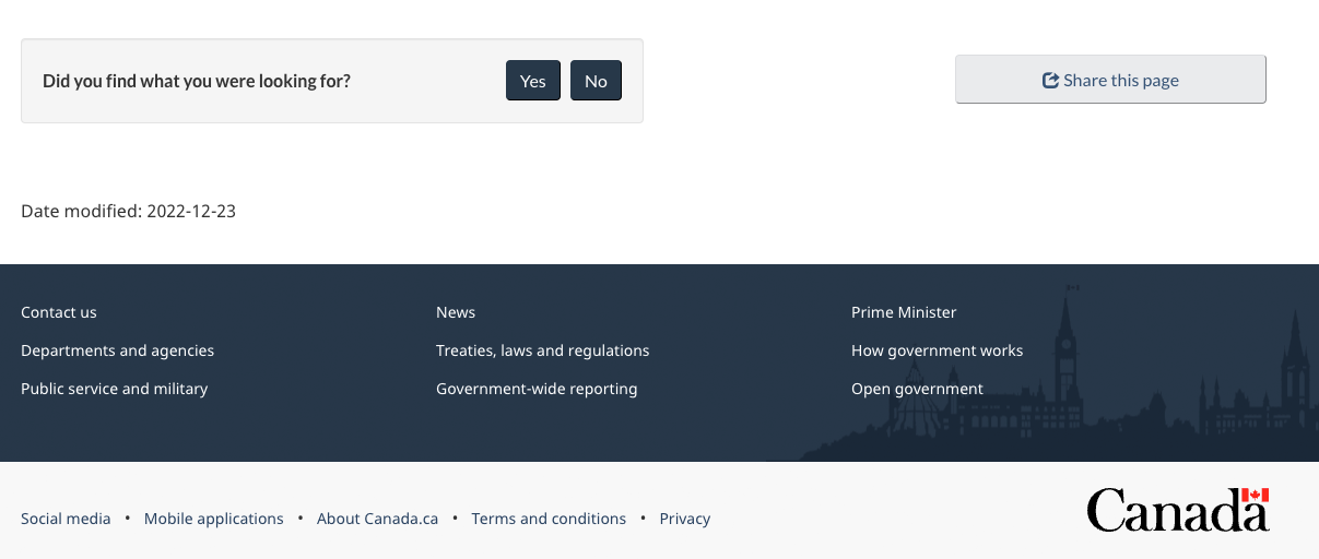
Image of the Canada.ca footer with the feedback tool

1. Initial view of the feedback tool

Image description: Initial view of the feedback tool
On page load, the feedback is located at the bottom of the web page above the date modified. A small gray well includes the prompt “Did you find what you were looking for?” followed by buttons for “Yes” and “No”.
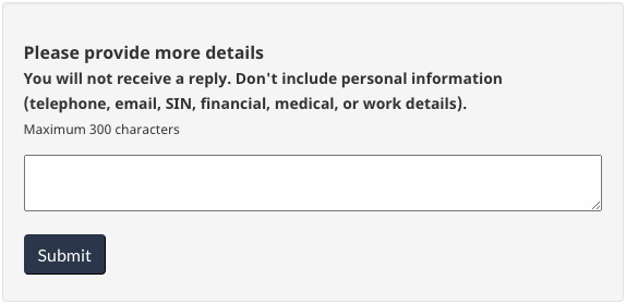
2a. Default view after selecting "No"

Image description: Default view after selecting "No"
After interacting with the “No” button in, a text entry screen will replace the prompt. There is a heading for “Please provide more details” followed by instructions to not include personal information: “You will not receive a reply. Don’t include personal information (telephone, email, SIN financial, medical, or work details. Maximum 300 characters.” There is a small text entry box followed by a button for “Submit”.
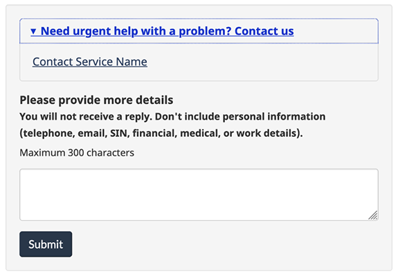
2b. Optional view after selecting "No" with contact option
The expand/collapse pattern labeled “Need urgent help with a problem? Contact us” will be closed by default.

Image description: Optional view after selecting "No" with contact option
After interacting with the “No” button, a text entry screen will replace the prompt.
In the contact option, there is an expand/collapse pattern with the header “Need urgent help with a problem? Contact us”. When the expand/collapse pattern is opened, there is a customizable link to contact the service.
After the expand/collapse pattern, there is a heading for “Please provide more details” followed by instructions to not include personal information: “You will not receive a reply. Don’t include personal information (telephone, email, SIN financial, medical, or work details. Maximum 300 characters.” There is a small text entry box followed by a button for “Submit”.
3. View after selecting "Yes" or after submitting feedback

Image description: View after selecting "Yes" or after submitting feedback
When users select “Yes” from the initial prompt or after submitting their feedback, a thank you message is displayed. There is a green checkmark icon followed by the heading “Thank you for your feedback”
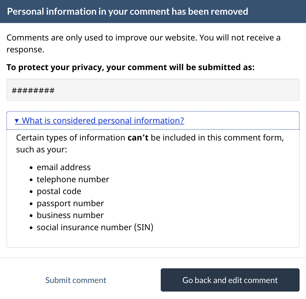
4. Pop-up message if personal information is detected
When a user submits a comment containing personal information, a popup message will appear.
Any detected personal data will be displayed as ### in the preview. Users can then either edit their original comment or proceed and submit their comment with the redaction automatically applied.
The expand/collapse pattern labeled “What is considered personal information” will be closed by default.

Image description: Pop-up message if personal information is detected
Upon submitting a comment containing personal information, a pop-up message will replace the prompt.
The user is reminded that they will not receive a response when submitting feedback, “Comments are only used to improve our website. You will not receive a response.”
A preview of the user’s comment is displayed and any personal information is replaced by hashtags, “To protect your privacy, your comment will be submitted as:”
There is an expand/collapse pattern with the header “What is considered personal information”. When the expand/collapse pattern is opened, there is a list of types of personal information that can’t be included in the feedback form.
- email address
- telephone number
- postal code
- passport number
- business number
- social insurance number (SIN)
There are two buttons at the bottom of the pop-up.
One button for “Go back and edit comment” and one for “Submit comment”
Protecting personal information
Filters are in place to remove these common types of personal information and profanity if submitted:
- phone numbers
- email addresses
- social insurance numbers
- passport numbers
- postal codes
- curse words
When personal information is automatically scrubbed, it is replaced with hashtags (###).
When profane words are removed, they are replaced with asterisks (***).
Page details
- Date modified: