Most requested band: Canada.ca design
Last updated: 2025-06-25
The most requested pattern features top tasks for landing pages that offer many choices. Top tasks are the main things that users are trying to do in a given context. The most requested pattern functions as a band that runs across the full width of the page on which it appears.

On this page
When to use
Use this pattern on landing pages where people are trying to find where to start their task, such as a topic page or an institutional landing page.
The most requested pattern is required in the following mandatory templates:
What to avoid
Don’t use this pattern when you want people to stay on the page and do their task.
Don’t use this to promote departmental preferences. Use data and evidence to determine the top tasks people are trying to access.
Don’t present different top tasks on the English and French versions of the landing page. Top tasks should be the same in both languages.
Content and design
Find content and design specifications and visual examples.
Content specifications
The heading is “Most requested” in English and “En demande” in French.
Include links to relevant top tasks - use evidence and data to determine which links should appear.
Organize the links in a bulleted list.
Make bullets visible so links are easy to scan.
Recommended maximum of 8 links.
Use task-oriented, plain language link labels (avoid program names or titles that may be unfamiliar to people).
On large screens:
- the heading appears to the left of the links
- the list of links appears in up to 2 columns
On small screens:
- the heading appears above the links
- the list of links appears in a single column
Design specifications
-
Layout:
- Columns: 2 columns of bullets on large and medium screens, single column of bullets on small screens
- Tab order: left to right, then top to bottom
-
Styling:
- Background colour: #f5f5f5
- Font family: Lato
- Font weight: Bold
- Heading: H2, Lato: 24px (desktop), 22px (mobile)
- Line height: 1.8em
- Text size: 18px (desktop and mobile)
Visual examples

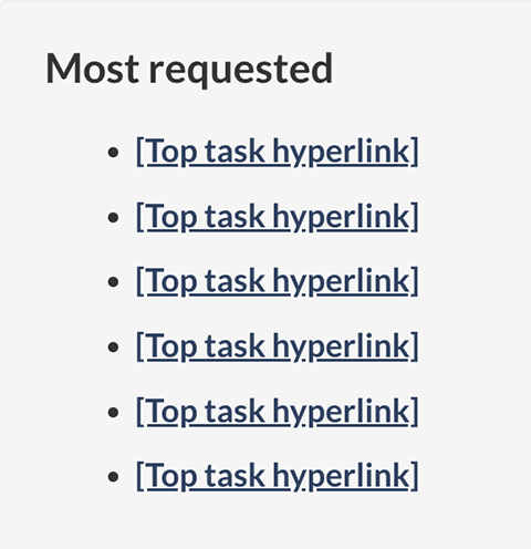
Image description: most requested - large screen
Most requested links appear in a horizontal band with the heading “Most requested”. Links are organized in a bulleted list.

Image description: most requested - small screen
Most requested links appear in a bulleted list underneath the heading “Most requested”.
How to implement
Find working examples and code for implementing the most requested pattern.
GCweb (WET) theme implementation reference
The implementation reference includes how to configure elements of the most requested band.
Implementations
Determine what best suits the type of page you're creating.
GC-AEM
For the Government of Canada Adobe Experience Manager (AEM):
Research
The banded approach to the most requested pattern was successfully tested on the Canada.ca home page in 2018.
As part of the Contact the Canada Revenue Agency (CRA) project in 2019, the banded approach was successfully tested on a prototype of the CRA institutional landing page.
The usefulness of most requested links for navigation pages was reconfirmed as part of the Wayfinding project in 2022.
Latest changes
- Removed optional label as the pattern is mandatory on some templates.
- Updated typography specifications in tandem with alignment activities for GCWeb and GC Design System.
- Updated guidance to reflect the banded style for the most requested pattern
- Documented the most requested pattern
Page details
- Date modified: