
Contact us band: Canada.ca design
Last updated: 2024-04-03
The Contact us band provides relevant contact information. The band runs across the full width of the page on which it appears.

On this page
When to use
Only use the contact us band on pages where contact information is a top task (ie. on an institutional landing page). When contact information is a secondary task, consider using a contextual footer instead.
Use the contact us band on pages to:
- present contact information consistently in a variety of contexts
- provide access to multiple contact options
What to avoid
Don’t add borders to this band.
Don’t add non-contact links in a contact band.
Content and design
Find content and design specifications and visual examples.
Content specifications
Use a descriptive heading that starts with ‘Contact’ or ‘Contacts’.
Use descriptive link text so it's clear what contact information the user will be brought to.
The optimal number of links is three.
If you are using a contextual footer that contains the same contact links, ensure you use the same link labels.
Design specifications
-
Text uses standard Canada.ca styles:
- Typography
- Colours
- Heading is coded as an H2 but styled as an H3
- Make the links bold and arrange them in a horizontal no-bullet list
-
Background:
- Default colour: #f5f5f5
-
Padding:
- Bottom: 15px
- Top: 15px
-
Layout:
- If you have multiple sets of links to present on the same page, you can use more than one contact us band on the page in alternating background colours of white and grey (zebra striping).
Visual examples
Image description: standard contact us band - large screen
A horizontal grey band with a Contact us heading followed by three links in a single row. The first link is Contact [Institution], the following links are placeholders for top contact tasks.
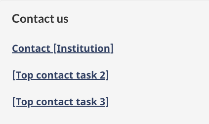
Image description: standard contact us band - small screen
A single column with light grey shading in the background. A Contact us heading is followed by three links. The first link is Contact [Institution], the following links are placeholders for top contact tasks.
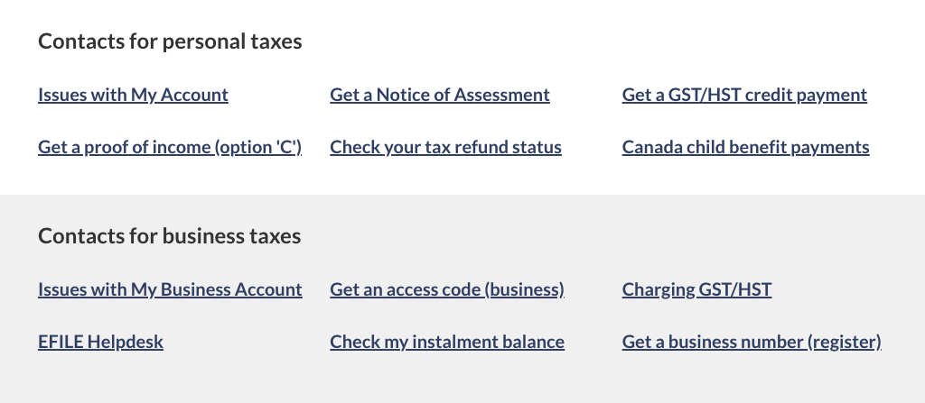
Image description: multiple contact us bands - large screen
A horizontal white band with a Contacts for [subject] heading followed by six links. The links are presented in two rows with three links in each row.
Following the white band is a horizontal grey band with a Contacts for [subject] heading followed by six links. The links are presented in two rows with three links in each row.
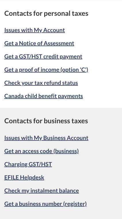
Image description: multiple contact us bands - small screen
A single column with white shading contains a Contacts for [subject] heading followed by six links.
Following that column is a single column with grey shading contains a Contacts for [subject] heading followed by six links.
How to implement
Find working examples and code for implementing the contact us band pattern.
GCweb (WET) theme implementation reference
The implementation reference includes how to configure elements of the design system.
Implementations
Determine what best suits the type of page you're creating.
GC-AEM
For the Government of Canada Adobe Experience Manager (AEM):
Research and rationale
Consult research findings and policy rationale.
Research findings
Canada Revenue Agency and the Canada.ca Experience Office developed contact bands as part of the optimization project for CRA contacts. We found contact bands to be useful for providing access to specific contact information for different services.
Policy rationale
The Contact us band is required in the following mandatory templates:
Latest changes
- Updated the guidance to include content and design specifications, visual examples and implementation guidance
Page details
- Date modified: