Interactive questions design pattern: Canada.ca design
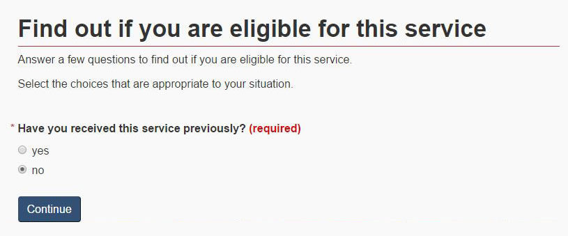
The interactive questions pattern is used to present people with a sequence of simple questions that leads to the specific answer they need to continue with or complete their task. The interactive questions pattern can be used to help people understand eligibility criteria, applicability of rules, or compliance requirements that depend on specific situations or conditions.
When to use this pattern
- Use to guide people to an appropriate answer by asking them a series of questions
How to use this pattern
- Use defined presentation classes for the field flow interface included in WET
Introducing interactive questions
-
The heading for this pattern must express the goal of the set of interactive questions
- for example, “Find out if you can renew your passport online”
- Optionally provide an overview of the results people can expect from completing the interactive questionnaire
- Optionally provide brief instructions above the questions
Presenting questions
- Keep the number of questions to a minimum (no more than 7 per sequence)
- Each question must be written to a person reading it (use “you” and “your”)
- Present choices or options immediately after each question, ensuring they are written as possible answers to the question above
- When presenting choices, use standard form controls like radio buttons, checkboxes, and drop-down menus; ensure you cover off all possible choices
- Where possible, pre-select the most common or optimal choice
Grouping questions
- Present questions one at a time to keep focus on the current question; keep each subsequent question on the same page in the same place as the previous question
- Always place questions in context (for example, on the eligibility page within the Service Initiation template )
Moving through the sequence of questions
- Always use buttons for navigating though the sequence of questions (buttons labeled “continue” or “next” to trigger the next question or the answer)
- Ensure people are able to go back to undo or change an earlier selection, via buttons or links (such as a link labeled “change your selection”)
- Any buttons used for navigating through the questions must be labeled appropriately for the context (for example, “Continue” might make sense in one situation, but a clearer choice in another might be, “Find out if you’re eligible”)
- When interactive questions are combined with the multi-page navigation pattern (such as in a service initiation template), avoid using “next” to avoid confusion between the 2 types of buttons
Presenting answers
- Always summarize the choices people have made and ensure they can go back to undo or change an earlier selection
- Explain the answer clearly and simply
- Provide links to the next action that people should take based on the answer they are given
Research and blog posts
Working example
Example

Page details
- Date modified: