Weather optimization: Research summary
The Weather optimization project kicked off in July 2017. Environment and Climate Change Canada’s Weather Office pulled together a collaborative team from E-Communications, and the Meteorological Service of Canada. Combined with the designers and researchers from the Canada.ca Experience Office, we set out to make it easier for Canadians to understand notifications about dangerous weather conditions.
Discovery
We started with a discovery phase to understand the current situation, people's needs related to the current content, and problems they may be having. Sources included reviewing previous usability studies, analyzing website traffic patterns and search behaviours, and reviewing phone and support requests. This provided enough insight to determine target audiences, which we then used to talk to people affected by the current content. We also researched weather applications and how they are used.
We also found tt most people were accessing the content using mobile devices. People were checking daily weather forecasts, long-term forecasts, or extreme weather warnings on their smartphones.
From these disvery insights, the team generated 7 task scenarios:
- Task: What will the weather be like in your area for the rest of the day?
- Task: You rode your bike to work. Is there more than a 50/50 chance (yes/no) you will get wet cycling home at 5:00?
- Task: It's Sunday morning, and you need to drive to Kingston for a Monday noon meeting. Should you leave this evening, or tomorrow morning?
- Task: You are camping, and hear a rumour around the campsite that there might be hail. Hail would rip holes in your expensive tent. Should you rush to pack up your camp site this morning or take your time this evening?
- Task: You want to take the dog for a short walk before it rains. Is it already raining anywhere in the Ottawa area yet (yes/no)?
- Task: You are coaching children's soccer tonight. You have to cancel if the humidex is above 40 degrees. Should you cancel the game or not?
- Task: You are a golf course manager - the sky looks dark. Find out (yes/no) whether you should clear the course because of the potential of lightning in the next 10-20 minutes.
We used these task scenarios to test the website with people in our target audiences.

Detailed description
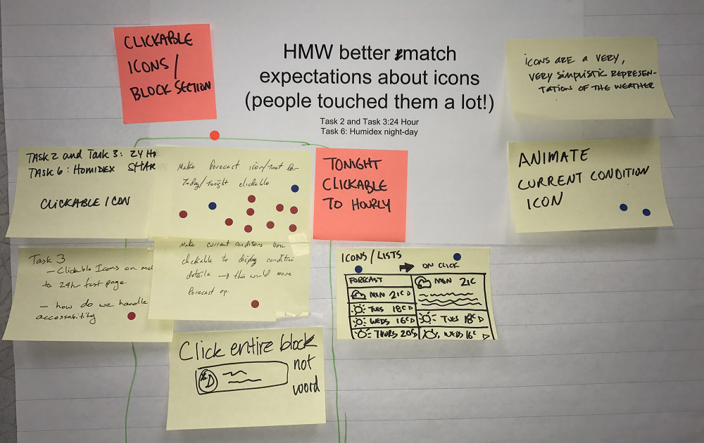
Solutions being voted on, which is on a printed paper sheet.
HMW (how might we) better match expectations about icons (people touched them a lot!)
Task 2 and Task 3: 24 hour. Task 6: Humidex night-day.
Sticky notes are placed on top of the print out, sticky notes with similar ideas are grouped together.
Sticky grouping 1:
There are 14 voting dots on this group.
- make forecast icon/text for today/tonight clickable
- tonight clickable to hourly
- click entire block not word
- clickable icons/block sections
- clickable icon
- clickable icons on (illegible) to 24 hr test page/ how do we handle accessibility
- make current conditions box clickable to display condition details - this would move forecast up
Sticky note grouping 2:
There are 2 voting dots on this group.
- icons are a very simplistic representation of the weather
- animate current icon
Establishing a baseline
Before making changes, we established a baseline score through moderated usability testing. 16 participants attended research sessions with their smartphones, in Toronto, Gatineau, Montreal and Ottawa. A further 4 participants were tested remotely on their desktop computers. Recruitment focused on individuals who were either employed or self-employed full-time outside the home. Participants were asked to complete the 7 task scenarios on the Canada.ca website.
We watched videos of the testing sessions together. This helped the entire team understand the problems people had in trying to complete the tasks. We could observe and quantify behaviours and usability issues that caused task failures. We captured these observations in click paths (to understand how people moved throughout the site) and described the problems in detailed issues so we could address them during the design phase.
Redesign to improve task success
For the baseline test, the overall findability rate was 35%, and the overall success rate was 33% across the 7 tasks and 140 task trials.
To solve the long list of issues we captured, the team created a working prototype for a new design on the Github code-sharing site. We held several workshops to work intensively on issues that participants experienced.
Throughout the design process, we tested content with people through small, informal "guerilla" sessions. These tests revealed problems with our designs that we were able to address before beginning a second round of full-scale moderated usability testing.
Alert design before and after mobile redesign for validation
Video description
Two smartphones are shown with 2 different versions of a web page. One is labelled "Baseline", the other "Redesign".
In the "Baseline" page, the title is "Ottawa (Kanata-Orléans) ON” followed by a weather alert box in yellow with the text "Severe thunderstorm watch in effect". An arrow points to the alert box with the annotation "Baseline: Few people realized they could click the warning to see details about the storm”.
In the "Redesign" page, the weather alert box in yellow has been changed: there is now a small warning icon, the text is now underlined to show it can be clicked, and there is a chevron on the right. This image is animated, and the phone screen slowly scrolls up and down to show the alert is duplicated below the forecast which is lower on the page. An arrow points to alert text with the annotation "Redesign: Everyone noticed and clicked the warning - either at the top or in the forecast".
City page design before and after mobile redesign for validation
Video description
Two smartphones are shown with 2 different versions of a web page. One is labelled "Baseline", the other "Redesign".
The "Baseline" page is animated and scrolls to the bottom, past the Current Conditions, Forecast, Averages and Extremes, etc. The page is very long and the commonly used links are found at the end. An arrow points to the list of links with the annotation "Baseline: Huge page to scroll. Participants didn't find important task links all the way at the bottom of the page".
The "Redesign" page is also animated, and scrolls to just underneath the Current Conditions. This part of the page has been changed so that the content is in two columns, and the links are now easy to find. An arrow points to the list of links with the annotation "Redesign: Content has been streamlined. Short page. All participants found important links next to forecast".
Measuring success rates on the redesigned prototype
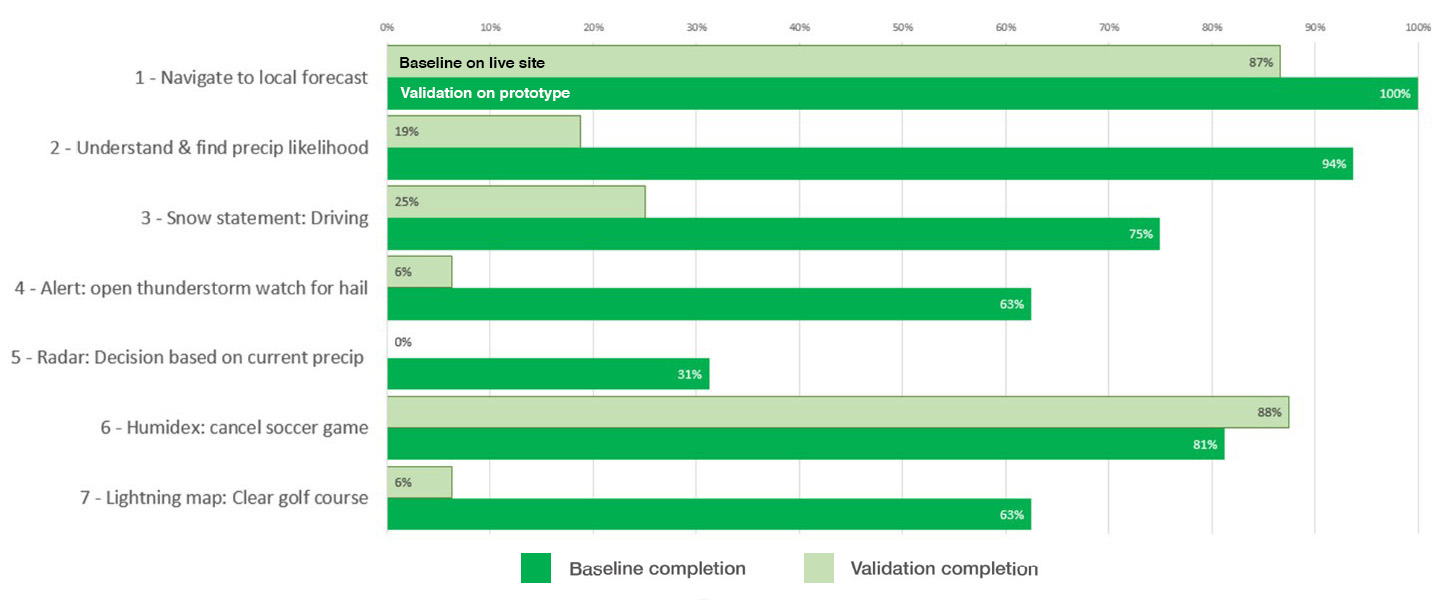
Once the revised design was ready, 20 new participants were recruited to complete the same 7 tasks. Our target was either 80% success, or an improvement of at least 20 points over the baseline score. The revised content and design improved findability rates from 35% up to 82%. Overall task completion success rose from 33% to 72%.
This chart shows the task completion success rates across the baseline and redesigned validation test on the prototype for all 40 participants:
Task completion success rates – table
Baseline measurement at start of project, validation on prototype redesigned by project team.
| Task | Baseline | Validation |
|---|---|---|
| 1. Navigate to local forecast | 87% | 100% |
| 2. Understand & find precipitation likelihood | 19% | 94% |
| 3. Snow statement: Driving | 25% | 75% |
| 4. Alert: Open thunderstorm watch for hail | 6% | 63% |
| 5. Radar: Decision based on current precipitation | 0% | 31% |
| 6. Humidex: Cancel soccer game | 88% | 81% |
| 7. Lightning map: Clear golf course | 6% | 63% |
Key drivers of success
The team derived this set of 6 design principles that appeared to have the most impact on improving success rates:
- Design for mobile first: less prose, more space and interaction
- Reduce layers: group tasks and sub-tasks together to improve findability
- Shorten breadcrumbs: this made important weather details more visible
- Maximize real estate: changing the alert style helped Canadians find weather alert details
- Bring top tasks up: don’t dilute content with tiny tasks
- Show answers not information: craft answers for top tasks
Request the research
Email us at cds.dto-btn.snc@servicecanada.gc.ca if you have questions, or would like to know more about this research.
What do you think?
Let us know what you think about this project. Tweet using the hashtag #Canadadotca.
Explore further
- See the updated weather pages based on the new designs in this project
- Read overviews of other projects with our partners
Page details
- Date modified:
