Travel advice and advisories: Research summary
The travel advice and advisories optimization project took place from January to March 2019. The goal was to make it easier for Canadians to find and understand the travel advice and guidance available on Canada.ca. The project team was co-led by the Treasury Board Secretariat Digital Transformation Office (DTO), and Global Affairs Canada (GAC).
It also included GAC’s partners in delivering travel-related content:
- Immigration, Refugees and Citizenship Canada (IRCC)
- Public Health Agency of Canada (PHAC)
- Health Canada (HC)
- Canada Border Services Agency (CBSA)
What made this project stand out
Mobile access
Analytics told us that Canadians increasingly use their mobile devices to access travel information on Canada.ca. For this reason, both baseline and prototype testing focused on mobile use. Test participants either used their own device, or resized their desktop browser to simulate a mobile interface.
Communicating risks
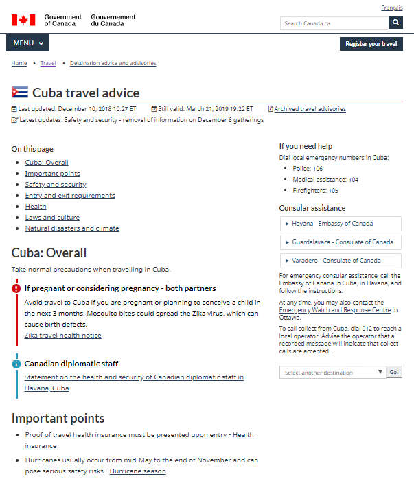
Travelling has a degree of risk. Most travellers take routine precautions against familiar risks, like theft or injury. The Government of Canada can’t prevent Canadians from travelling, but has an obligation to protect them from harm. We inform Canadians when they should change their routine behaviour or avoid travel altogether to stay safe. It’s critical that we design web pages that clearly and succinctly convey both the nature and the level of risk. To do this, the project team designed a new page template for destinations. The design prioritizes "must know" risks using a new alert pattern and a carefully curated short list of important points.
Encouraging people to look at both generic and destination-specific advice
There are many pages in the travel section of Canada.ca that provide general advice. This includes guidance on travel documents, travelling with children or pets, travel insurance and vaccinations. Often destination-specific pages duplicated this content. Testing uncovered a persistent challenge where people found general advice and assumed they had all the information they needed to make decisions about travelling. They were missing critical destination-specific advice. To address this we removed duplicate "generic" advice from destination-specific pages. We linked to it instead. We also grouped content differently on the navigation. We increased the visibility of topics such as "Planning your trip" and added a "Before you go" checklist. These changes helped people navigate more effectively between both types of advice.

Establishing a baseline
In the baseline study, 19 Canadian travellers performed 147 tests on the live Canada.ca travel pages. The overall success rate was 23%.
The most common problems participants encountered were:
- not understanding the (sometimes subtle) differences between advice, advisories, and notices
- not understanding the different levels or types of travel risk—safety, security, health—and their significance for travel planning
- "satisficing" by answering the task question with information that seemed close enough to an answer, even if it was incomplete or incorrect
- failing to find answers published under a heading where people didn’t think to look (for example, guidance about illegal medications placed under "Laws and culture" but not under "Health")
- headings that acted as "dirty magnets"—suggesting content that didn’t provide the answer (for example: "How we help," leading to profiles of individual consular officers rather than details about the services provided to Canadian travellers)
- long, dense pages of text that don’t support scanning, making it easy to miss crucial details
- tasks requiring prior knowledge, such as knowing that London, England is in the United Kingdom
Designing for user success
Intensive workshops with the extended project team helped us to deliver a prototype with significant improvements.
These included:
- a revised travel information architecture, with fewer topics and more task-centered labels to improve information scent (for example, "Planning your trip" instead of "Travel abroad")
- a more consistent relationship between parent topic labels and their subtopics
- a "safety net" approach to content design (for example, information about illegal medications—which can lead to arrest and imprisonment in some countries—is highlighted as an "Important point" described in detail under "Laws and culture" and cross-referenced under "Health > Medications")
- scannable, easy-to-read pages about critical topics and common situations requiring assistance
- plenty of headings, bulleted lists, and "on this page" navigation links
- conversion of the extremely valuable travel checklist from a publication (often missed by participants) into a prominently-placed web page
- a revised destination directory highlighting high-risk destinations (those with "do not travel" or "avoid non-essential travel" advisories)
- a revised destination search function that supports search using alternate place names
- a redesigned destination page template, replacing the multi-page tabbed design with a single page using "on this page" navigation links
- destination-specific contact and service information placed more prominently on destination pages
Measuring success rates on the redesigned prototype
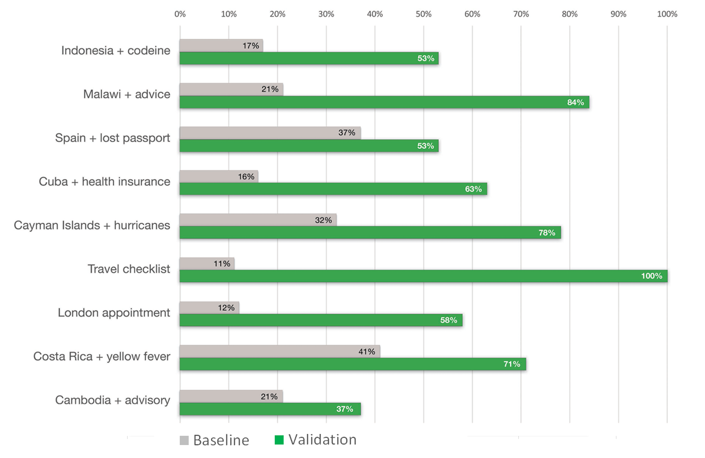
The team tested the redesigned prototype with a new set of 19 Canadian travellers. They performed 146 tests of the same task scenarios as in the baseline testing. Our target was either 80% success or an improvement of at least 20 points over the baseline score. The revised content and design improved findability rates from 49% to 88% (+39% pts). Overall task success rose from 23% to 72% (+49% pts).
This chart shows a comparison of task success rates between the baseline and validation tests for all 38 participants.
Task completion success rates – table
| Task | Baseline | Validation |
|---|---|---|
| Idonesia + codeine | 17% | 53% |
| Malawi + advice | 21% | 84% |
| Spain + lost passport | 37% | 53% |
| Cuba + health insurance | 16% | 63% |
| Cayman Islands + hurricanes | 32% | 78% |
| Travel checklist | 11% | 100% |
| London appointment | 12% | 58% |
| Costa Rica + yellow fever | 41% | 71% |
| Cambodia + advisory | 21% | 37% |
Key drivers of success
The features of the prototype that had the biggest impact on success rates were:
- Headings that are simple, informative and task-oriented: "Planning your trip," "Before you go," "When things go wrong"
- A page design for destinations where critical information stands out, supporting details are relevant, and additional detail is linked to instead of duplicated
- Content pages that are scannable, with clear and plentiful headings, bulleted lists, and only essential links
Request the research
If you’d like to see the detailed research findings from this project, email us at cds.dto-btn.snc@servicecanada.gc.ca.
Let us know what you think
Tweet using the hashtag #Canadadotca.
Explore further
- Read our blog post: Content design tips from our Travel advice and advisories and Contact the CRA optimization projects
- Read overviews of other projects with our partners
Page details
- Date modified:
