Student loans and grants optimization: Research summary
In 2016, the Government of Canada supported 490,000 full-time students with a total of $2.7 billion in loans. Many students begin or manage their student loan journey through the Student loans and grants pages on Canada.ca. In the fall of 2018, we began a collaborative project to improve the success of students using those pages. The project team included members of the Canada Student Grants and Loans Program team, the Employment and Social Development Canada (ESDC) web team, and the Digital Transformation Office from Treasury Board.
We limited the project to the Canada.ca pages related to student aid. The National Student Loans Service Centre (NSLSC) is a separate website to which students must sign in.
Students mostly interact through their province
While the Government of Canada funds student loans, it is the provinces that manage them. Students use the provincial sites to apply and re-apply. They may never have any interaction with Canada.ca at all. It is not usually until they need to repay, or need help repaying, that they interact with any federal pages.
For the task of repaying a student loan, the “Maintain your student loan" page on Canada.ca was one of the most used pages. 87% of the visitors arrived via Google. From there, 59% proceeded to the login page of the NSLSC site.
Learning from the baseline study
In the spring of 2018, ESDC ran a usability test of some of the top student task scenarios. We were able to analyze that data to use a group of task scenarios as our baseline task performance measure. That study showed that navigating to the content was a real challenge. There were so many layers of topic pages that it took many clicks to reach the actual student loans pages from the home page.
Another challenge was the way content for grants and loans was divided. Because different program teams manage this content, they divided it into separate pages. This didn’t make sense for students though, as they apply for both loans and grants in a single application form.
Testing over several years had showed that students could find this single application form about 60% of the time. This project gave us a chance to tackle integrating grants and loans content. This let us provide a clear path to answers by removing layers of confusing program-centric information.
Redesigning for student answers not information
The project team focused on getting rid of the many pages of program information that didn’t help students with the answers they were looking for. In design workshops we physically cut up topic pages and discarded or moved topics around. This left us with a new, smaller set of pages. Then, we took the stripped-down content and focused on directing students to the provinces to apply, and to the NSLSC to manage their loans.
All roads lead to student aid
We looked at the analytics and previous studies. These showed that students used the Jobs, Benefits, and Money themes to get to content about student loans and grants. We left those routes in place, but we decluttered and shortened them.
Navigate by task, not program
We grouped loans and grants together in the new design, instead of leaving them in separate program sections. We moved program descriptions to the NSLSC site.
Design for answers, not information
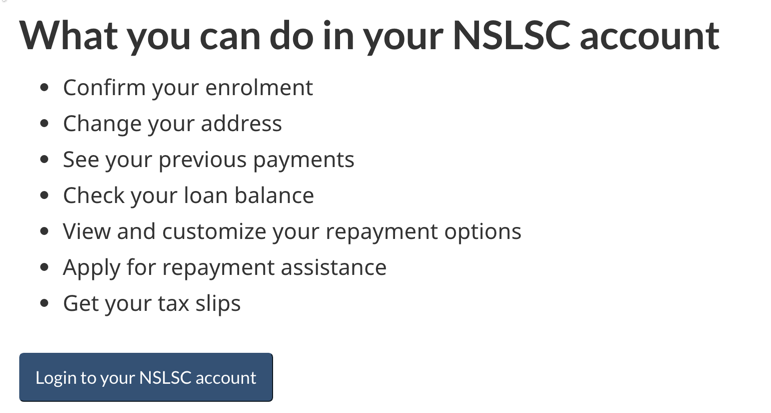
The baseline study showed that it was hard for users to find the NSLSC site and to understand what they could do there. People often seemed to forget the complex name of the National Student Loans Service Centre program. There were many searches on Google and Canada.ca for variations of ‘NSLSC’. To address this problem, the team used the term in the title of the new page: Manage your student loan at the NSLSC. We also added a single primary button to direct students to login to their NSLSC account.

Use evidence to design language
The team did research to understand how students were searching for information. They looked at Reddit posts, search data from within Canada.ca and Google search queries and trends. They used what they found to update content so students could find and understand it better.
| Before | After |
|---|---|
| Student grants and student loans | Student grants and loans |
| Student financial assistance | Student aid |
| Grace period for six months | 6 month non-repayment period |
| One-time payment | Lump-sum payment |
Measuring success
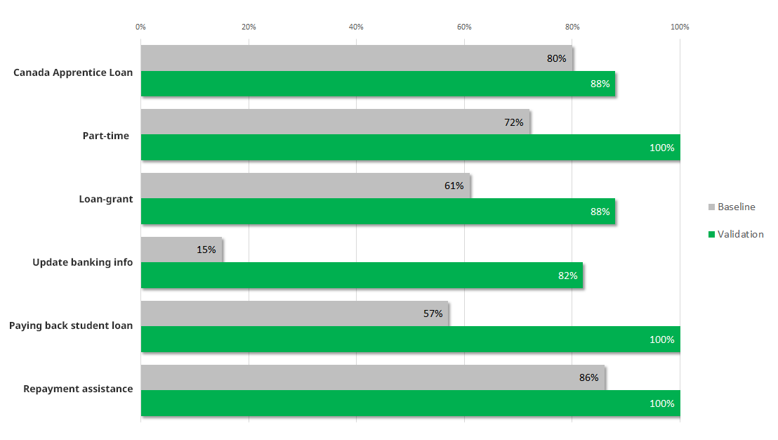
Overall task performance went up from 61% success to 88% when we retested the task scenarios on the prototype.
This chart shows the baseline measurement at the start of the project compared with the validation measurement on the prototype redesigned by project team.
Task completion success rates – table
| Task | Baseline | Validation |
|---|---|---|
| Canada Apprentice Loan | 80% | 88% |
| Part-time | 72% | 100% |
| Loan-grant | 61% | 88% |
| Update banking information | 15% | 82% |
| Paying back student loan | 57% | 100% |
| Repayment assistance | 86% | 100% |
What we learned
To better serve Canadians, teams have to remove their program information and focus on providing answers and service. For student loans, that meant guiding users to the provinces and the NSLSC. The Canada.ca pages are only there to fill the answer-gaps between those service points.
Request the research
If you’d like to see the detailed research findings from this project, email us at cds.dto-btn.snc@servicecanada.gc.ca.
Let us know what you think
Tweet using the hashtag #Canadadotca.
Explore further
- See the updated Student aid pages
- Read our blog post: Six content design tips from our Student loans and Parental benefits optimization projects
- Read overviews of other projects with our partners
Page details
- Date modified:
