Recalls and safety alerts: Research summary
The Recalls and safety alerts optimization project kicked off in the spring of 2018. In this project the team was looking at food and product recalls and safety alerts on Canada.ca. The goal was to make this content easier for Canadians to find and understand. Designers and researchers from the TBS Digital Transformation Office (DTO) partnered with Health Canada (HC), the Canadian Food and Safety Inspection Agency (CFIA), Transport Canada (TC), and Environment Canada (EC). Together we formed a multi-disciplinary team with members from web communications, strategic communications, program areas and IT.
What made this project stand out
At the outset of the project, CFIA reported that 89% of visitors to their homepage were using mobile. They also reported that 83% of the traffic to their All Recalls page came from Facebook. Given this reality, the project focused on mobile users first.
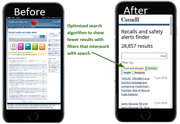
The design of the search filters is what made this project unique. The team took inspiration from industry leaders like Amazon to build a search interface that was tight, intuitive, and easy to use. We made the filters more obvious so that people could easily see and tap them on a mobile device. Like Amazon, we also used auto-complete in the search field to show possible filters that could help narrow the search.
Discovery
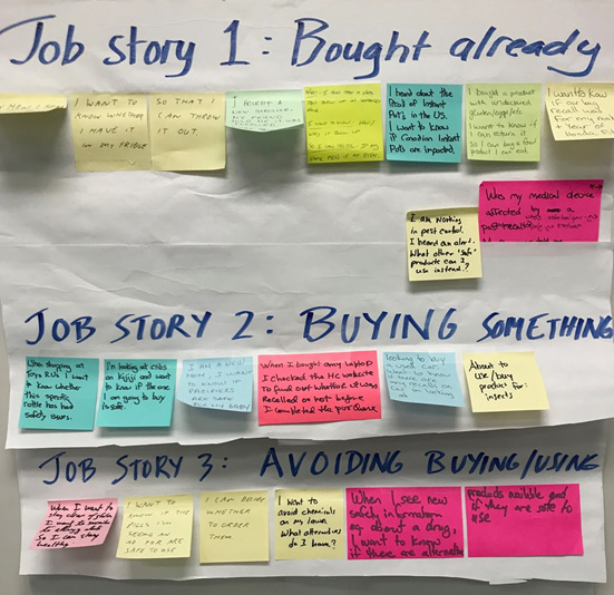
Together the team developed a set of user stories. These reflected the needs of real Canadian parents and what they try to do on Canada.ca. The stories followed a set structure:
- Bought it already: “When I hear about a recall on product I may have bought, I want to know if it’s the one I have so I can decide whether to return/toss the one I bought”
- Deciding whether to buy it: “When I am trying to buy product x, I want to know if there are recalls so I can decide whether to buy or not”
- Avoid buying it: “When I am responsible for people or my health, I want to know ahead of time about risks so I can avoid getting sick - warn others”

Establishing a baseline
The team conducted baseline usability testing to understand how the live site was performing. We wanted to see how Canadians currently navigate through the site and what issues they face when trying to complete basic tasks.
We started by designing typical tasks. We consulted our user stories to make the tasks realistic. Next, we recruited 19 Canadian parents from across Canada with a child 12 years old or younger. This is a typical profile of Canadians who check recalls online the most.
The baseline testing consisted of 17 English-language sessions on mobile phones and 2 French sessions where participants completed their tasks on their computers. In each test session, participants completed 12 tasks.
Participants used the live Canada.ca website to complete their tasks. The testing measured:
- findability rate: how often people successfully found the page on the website with the answer to the task
- success rate: how often people correctly identified and understood the correct answer to the task question
- time on task: how long it took to complete the task (only measured if the task had at least a 75% task completion success rate)
At the end of baseline testing, the overall findability rate across the 12 tasks was 51%. The overall success rate was 52%.
The team recorded the baseline usability testing sessions so we could make observations using clickpaths, screenshots, and compelling quotations taken from the videos. We watched select usability testing videos as a group to understand key issues and user behaviours.
Issues identified in baseline testing:
- site was not responsive - people pinched & zoomed (not a mobile-first design)
- separate unlinked recalls for the same problem
- people tried to use recalls like shopping pages, they wanted to click the brand name
- the list of affected products was difficult to consult
- difficult to use - long, unordered tables were hard to read on a phone
- recalls were written like press releases, so it wasn’t always clear what to do
Redesign to improve task success
The team identified the main issues. We held workshops to rearrange and rewrite content and look at possible design solutions.
We developed a working prototype in GitHub. Before validation testing, we did some guerilla testing to make sure our solutions worked. This testing helped identify areas in the prototype needed further improvements.
The prototype offered the following solutions:
- responsive template with new font and spacing
- clear titles with summary at the top
- links to brand and to category
- affected products in a filterable, responsive table if there were more than 6 items
- better headings
- shortened, more scan-able text for mobile

Detailed description
Image of two phones, labelled "Before" and "After".
The first phone shows how the original Recalls content displayed on mobile.
The second phone shows how the redesigned prototype text is much shorter and has more white space. You can see that 3 bullets immediately tell you the product, the issue and what to do. An arrow points to the text with the annotation "Answers not information - Highlight what to do".
Measuring success rates on the redesigned prototype
After ironing out any issues from the guerilla testing, the team began the validation round testing. Validation testing is how we confirm if our changes solved the problems uncovered in the baseline testing. 17 new participants completed the same 12 tasks on the redesigned prototype.
The goal for the validation round of testing in all optimization projects is either 80% success, or an improvement of at least 20 points over the baseline score.
These targets were exceeded:
- the findability rate rose from 51% up to 75%
- the overall task success rate rose from 52% to 86%
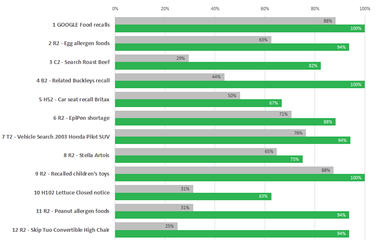
This chart shows the task completion success rates across the baseline and redesigned validation test on the prototype for all 34 participants:
Task completion success rates – table
Baseline measurement at start of project, validation on prototype redesigned by project team.
| Task | Baseline | Validation |
|---|---|---|
| 1. Google food recalls | 88% | 100% |
| 2. Eggs allergen foods | 63% | 94% |
| 3. Search roast beef | 29% | 82% |
| 4. Related Buckley's recall | 44% | 100% |
| 5. Car seat recall Britax | 50% | 67% |
| 6. EpiPen shortage | 71% | 88% |
| 7. Vehicle search 2003 Honda Pilot SUV | 76% | 94% |
| 8. Stella Artois | 65% | 75% |
| 9. Recalled children's toys | 88% | 100% |
| 10. Lettuce closed notice | 31% | 63% |
| 11. Peanut allergen food | 31% | 94% |
| 12. Skip Tuo convertible high chair | 25% | 94% |
Key drivers of success
The team derived this set of 4 design principles that appeared to have the most impact on improving success rates:
- Provide answers, not information
- Mobile is different: optimize task flow and simplify approach
- Customize search algorithms and add facets to help people find what they need
- Online is not paper: Canadians expect updated connected recalls & alerts
Request the research
If you’d like to see the research findings from this project, let us know. Email us at cds.dto-btn.snc@servicecanada.gc.ca.
What do you think?
Let us know what you think about this project. Tweet using the hashtag #Canadadotca.
Explore further
- Australia’s recall site - was used by participants in baseline testing and improved on in our final design
- Recalls and safety alerts: An optimization project to better protect Canadians, a blog post
- Read overviews of other projects with our partners
Page details
- Date modified:
