Electronic Procurement Solution (EPS) portal: Research summary
The Government of Canada purchases upward of $23 billion in goods and services annually. They currently use a procurement process that is labour-intensive for all participants. It is still in large part paper-based.
Public Services and Procurement Canada (PSPC) is implementing an electronic procurement solution (EPS). This will transform the purchasing process for both government buyers and for the businesses from Canada and around the world who supply goods and services.
The project is a multi-year initiative. It will see existing processes modernized through the implementation of a single platform based on two commercial solutions (SAP’s Ariba and Fieldglass applications).
As part of the transition to the new EPS, PSPC is planning to implement a new entry point to replace the existing Buy and Sell website.
The role of this new site (CanadaBuys) will be to support tasks like learning about government procurement, finding out how to become a supplier to the government, and searching for opportunities open for competitive bidding (also called tenders).
Between April and July 2019, the Treasury Board's Digital Transformation Office (DTO) partnered with the PSPC team responsible for the design of the new CandaBuys site.
We focused on the needs of businesses new to government procurement. We tested with small and medium enterprises not currently registered as suppliers to the Government of Canada.
Establishing a baseline
We did our baseline task performance testing on the existing Buy and Sell site.
In the baseline study, 18 small and medium enterprises performed 158 tests. The most common problems participants encountered were:
- complexity: the site has a lot of information, cluttered pages that are difficult to scan, technical terminology and jargon
- link splatter: too many links lead people away from the task they came to do
- poor search usability: homepage choices are actually canned searches that may include a large number of expired opportunities and award notices
- tender summaries make it difficult to differentiate relevant details from less important information
- crucial details buried in PDFs present a significant barrier
- PDF links had filenames that didn’t mean anything to the users so that in many cases it wasn’t obvious that these needed to be opened to find the relevant information
Designing for success
The CanadaBuys prototype was developed in Drupal. This was the first time the DTO team used Drupal instead of Github for prototyping. The advantage of Drupal is its WYSIWIG (what you see is what you get) interface. It allows more non-coders to contribute to content design and iteration.
We developed the prototype design through a series of intensive collaborative workshops with PSPC procurement experts. This allowed us to have a prototype with several innovations including:
Streamlined search interface and tender display
The prototyped search experience used a single search box on its opening page.
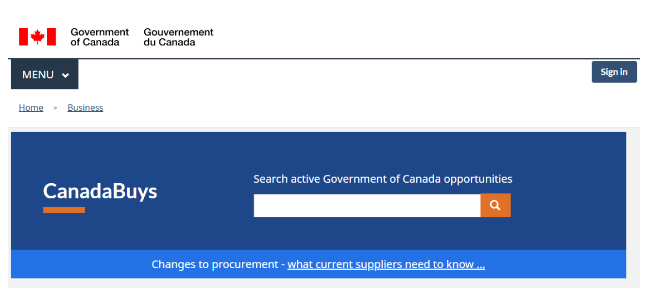
The CanadaBuys prototype
Heading text reads: CanadaBuys. There is a search field entitled "Search active Government of Canada opportunities". Below the search field is a link to "Changes to procurement - what current suplliers need to know".
It then presented a simplified set of facet options for narrowing results.
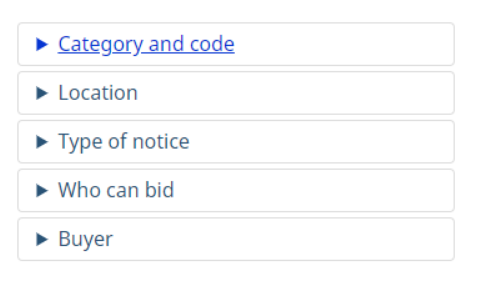
An example of the facets
Facets listed in this order: Category and code, Location, Type of notice, Who can bid, Buyer.
The options focused on considerations that would help suppliers to quickly eliminate irrelevant options.
- What kind of opportunity is this? A request for proposal (RFP), or an invitation to qualify for a standing offer or supply arrangement?
- Am I eligible to respond?
- Does it match what I sell or provide?
- When and where would the work need to be done?
- What is the deadline for responding?
Scannable opportunity summary display
In the prototype, tenders were formatted to provide essential details in a single, easy-to-scan format. They used the “on this page” pattern to aid navigation. Again, the focus was on making it easy for suppliers to determine:
- what the buyer is looking for
- what the evaluation criteria will be
- how to find potential partners
Long document pattern for RFPs, statements of work
Currently, most RFPs are published in PDF only. Businesses have to download the PDF before they can review or search within the document. The prototype experimented with a navigable HTML format for long documents. It used an interactive table of contents to allow people to easily access key sections like the statement of work.
Navigable hierarchy for product and service codes
The prototype used a simple keyword search to help businesses identify the UNSPSC or GSIN code for a specific product or service. Results showed the full hierarchy for context, and let users navigate through the tree.
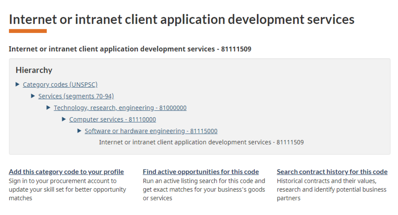
Internet or intranet client application development services
Heading text reads: Internet or intranet client application development services. Below the UNSPSC code for this type of service is listed in bold text: 81111509.
In a coloured box, the hierarchy for the code is shown:
- Category codes (UNSPSC)
- Services (Segments 70-94)
- Technology, research and engineering – 81000000
- Computer services – 81110000
- Software or hardware engineering – 81115000
- Internet or intranet client application development services - 81111509
A wizard to help suppliers identify their best “method of supply”
Knowing whether there is a supply arrangement that will allow your company to pre-qualify for government opportunities is one of the more complex aspects of learning how procurement works. The prototyped wizard made this easy. It asked simple questions and presented the best options for your good or service.
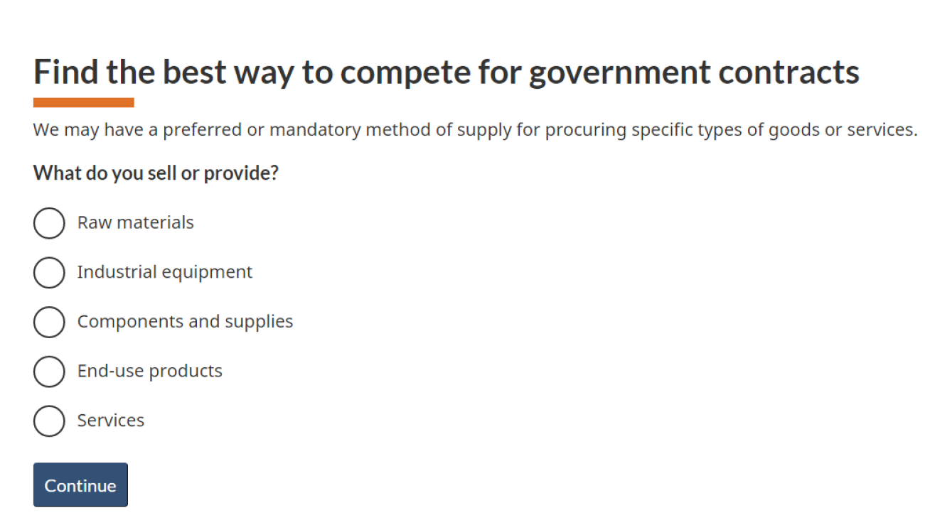
Identifying their best "method of supply"
The heading text for the wizard reads: Find the best way to compete for government contracts. It explains: We may have a preferred or mandatory method of supply for procuring specific types of goods or services. This is followed by a simple question: What do you sell or provide? The listed options are: Raw materials, Industrial equipment, components and supplies, end-use products, and services. Below is a button labelled Continue.
Measuring success rates on the CanadaBuys prototype
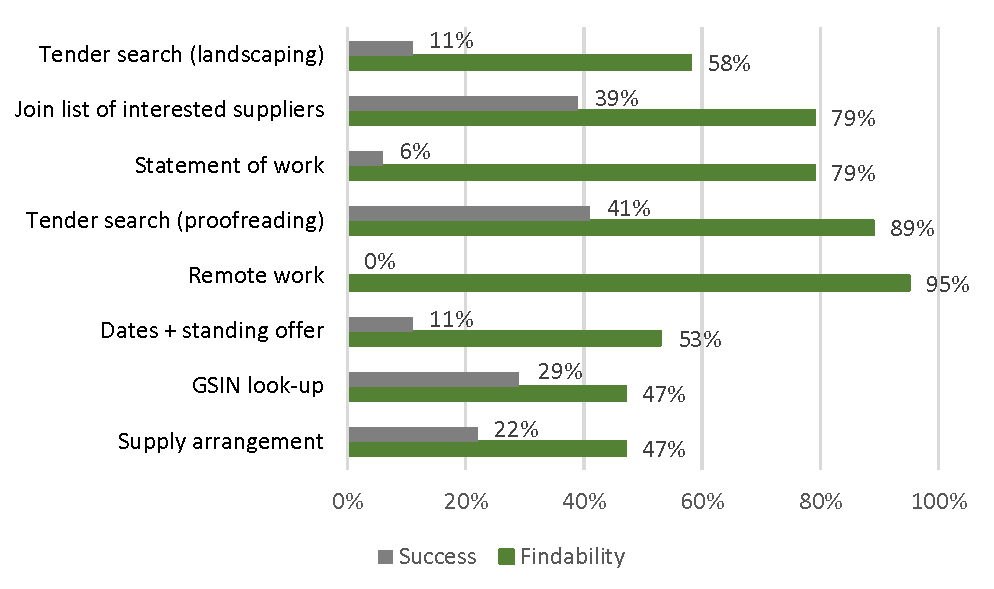
This chart shows a comparison of task success rates between the baseline and validation tests for all 37 participants.
Task completion success rates – table
| Task | Baseline | Validation |
|---|---|---|
| Tender search (landscaping) | 11% | 58% |
| Join the list of interested suppliers | 39% | 79% |
| Statement of work | 6% | 79% |
| Tender search (proofreading) | 41% | 89% |
| Remote work | 0% | 95% |
| Dates + standing offer | 11% | 53% |
| GSIN look-up | 29% | 47% |
| Supply arrangement | 22% | 47% |
Key drivers of success
The features of the prototype that had the biggest impact on success rates were:
- fewer words, clear labels, plain language
- a streamlined search experience with fewer, clearer choices for narrowing results
- simplified, scannable tender notice details that answer key questions for determining relevance and eligibility
- no PDFs
Request the research
If you’d like to see the detailed research findings from this project, email us at cds.dto-btn.snc@servicecanada.gc.ca.
Let us know what you think
Tweet using the hashtag #Canadadotca.
Explore further
- Read overviews of other projects with our partners
Page details
- Date modified:
