Diseases and immunization: Research summary
The diseases and immunization optimization project kicked off in the fall of 2017. The goal was to make it easier for Canadians to make informed choices about vaccination. Designers and researchers from the TBS Digital Transformation Office joined forces with Health Canada and the Public Health Agency of Canada. Together they pulled together a multi-disciplinary team from web communications, immunization and disease programs, and strategic marketing. It was important that this project align with the National Immunization Strategy’s goal of ensuring Canadians have the information and tools needed to make evidence-based decisions on immunization.
Discovery
The discovery phase to understand the current situation. Was the content on Canada.ca meeting people’s needs? What problems might they be having? We researched vaccine hesitancy and how that's been addressed around the world. We reviewed previous usability studies and analyzed website traffic patterns and search behaviours. We reviewed phone and support requests. This helped us to determine target audiences, which we then used to talk to people affected by the current content.
We also found that most people were accessing the content using mobile devices. People were checking whether they had the cold or the flu, when they needed vaccinations, or which vaccinations they would need for a specific country on their smartphones.
From these discovery insights, the team generated a set of job stories. Job stories are real-world scenarios that reflect what people are actually trying to do. They follow a structure like: When I … (the situation), I want to … (the motivation), so I can … (the expected outcome). For example:
- When it’s flu season, I want to know if/where the flu shot is available, so I can go and get it
- When I’m thinking about immunizing my child, I want to know if the vaccine is safe, so I can understand the risks
- When I return from a tropical trip, I want to know if I can be tested for Zika, so I can decide if I should delay getting pregnant

Detailed description
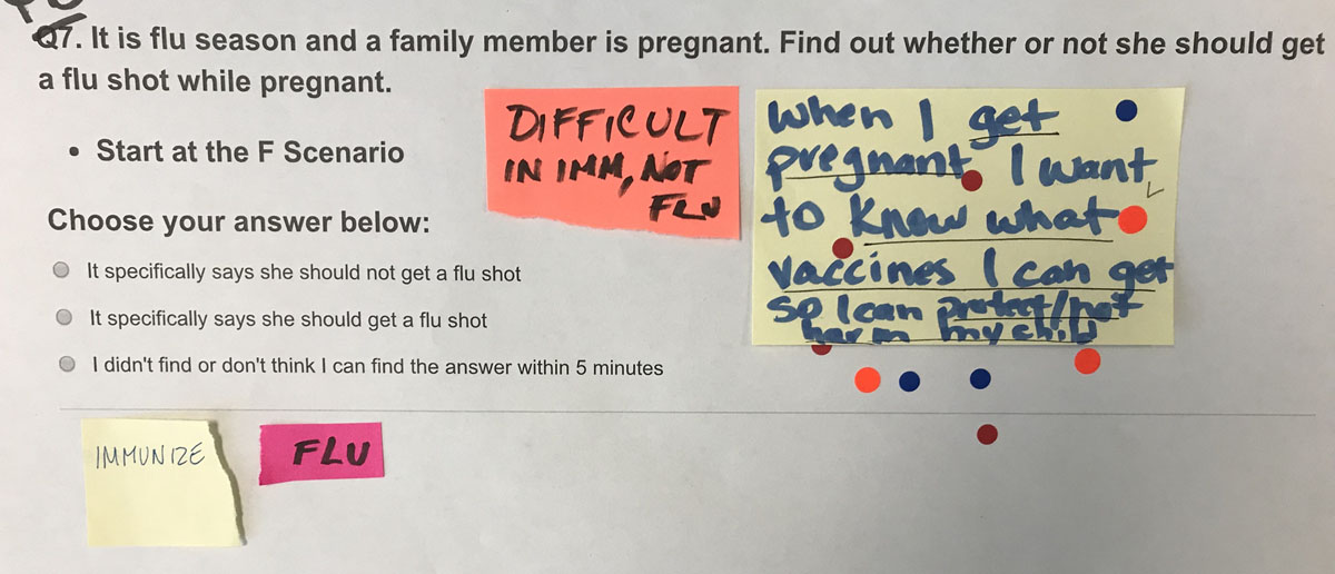
[Task being voted on, which is on a printed paper sheet]
It is flu season and a family member is pregnant. Find out whether or not she should get a flu shot while pregnant.
- Start at the F Scenario
Choose your answer below:
- It specifically says she should not get a flu shot
- It specifically says she should get a flu shot
- I didn't find or don't think I can find the answer within 5 mins
[Sticky notes are placed on top of the printed out task]
[Sticky note 1: Job story] When I get pregnant I want to know what vaccines I can get so I can protect/not harm my child [There are 10 voting dots on the note]
[Sticky note 2] Difficult in imm, not flu
[Sticky note 3] Flu
[Sticky note 4] Immunize
From the long list of job stories, the team voted to narrow down to the top 11 stories. We crafted these stories into task scenarios that could be used to test the website with people in our target audiences.
Establishing a baseline
Before making changes, we set up moderated usability tests. We wanted to understand how well the existing content on Canada.ca was performing with the public. We recruited 16 employed parents of children under 18. These participants attended research sessions in Toronto and Ottawa with their smartphones. Participants were asked to complete the 11 task scenarios on the Canada.ca website. If they had time, they repeated one task on the Ontario.ca site for comparison.
The task scenarios were presented in random order, except for the first and last tasks. Some tasks began on the home page of Canada.ca while others began on the Zika, Flu and immunization pages. The scenarios were presented on a tablet beside the participant. The participant could refer to the tablet while they attempted the task, and then return to enter in their answer and proceed to the next question.
The 3 important measures for optimization studies are:
- findability success rate: whether people find the page designed as the target for that task
- task completion success rate: whether people successfully select the correct answer to the task scenario
- time on task: how long it takes to complete the task (only measured if the task had at least a 75% task completion success rate)
For the baseline test, the overall findability rate was 66%, and the overall success rate was 53% across the 11 tasks and 176 task trials.
We watched videos of the testing sessions together. This helped the entire team understand the problems people had in trying to complete the tasks. We could observe and quantify behaviours and usability issues that caused task failures. We captured these observations in click paths to understand how people moved throughout the site. We then described the problems in detailed issues so we could address them during the design phase.
Redesign to improve task success
To address the list of issues we captured, the team created a working prototype for a new design on Github. We held several workshops with smaller teams to work intensively on issues that participants experienced. For example, the Zika team realized that test participants hadn't absorbed the serious risks of pregnancy after exposure to Zika. The project team worked hard to integrate content to counter vaccine hesitancy. And new home page designs for Canada.ca were created. These expose the links to Health and Travel that people missed in the baseline tests. (Before, the links were hidden in a menu that remained closed unless the menu icon was clicked).
Throughout the design process, we tested content with people through small, informal “guerilla” sessions. These tests revealed problems with our designs that we were able to address before full-scale moderated usability testing.

Detailed description
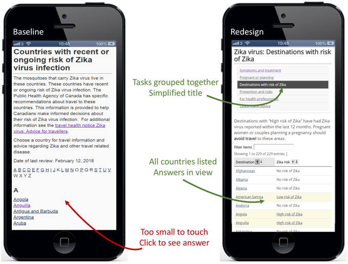
Two smartphones are shown with 2 different web pages. One is labelled "Baseline", the other "Redesign". In the "Baseline" page, the title is "Countries with recent or ongoing risk of Zika virus infection", followed by 2 long paragraphs of text that are too small to read. Following that is a list of countries beginning with "A", starting with Angola, Anguilla, Antigua and Barbuda, Argentina, and Aruba. An arrow points to the country list with an annotation "Too small to touch. Click to see answer.".
In the "Redesign" page, the title is "Zika virus: Destinations with risk of Zika". Below is a list of 6 links that are too small to read, one of which is highlighted. An arrow points to the highlighted link with the annotation "Tasks grouped together. Simplified title".
Below that is a short paragraph of text too small to read, followed by a search box and a table showing countries with "No risk of Zika", "Low risk of Zika" or "High risk of Zika" next to them. An arrow points to the countries with an annotation "All countries listed. Answers in view."
Measuring success rates on the redesigned prototype
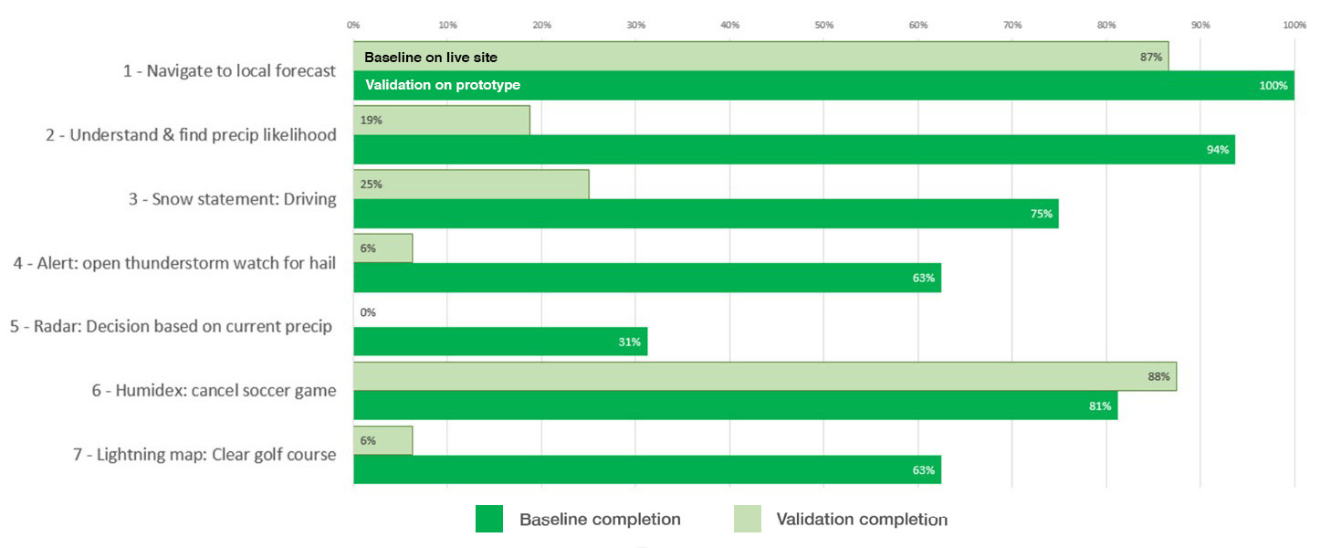
Once the revised design was ready, 16 new participants were recruited to complete the same 11 tasks. Our target was either 80% success, or an improvement of at least 20 points over the baseline score. The revised content and design improved findability rates from 66% up to 90%. Overall task completion success rose from 53% to 84%.
This chart shows the task completion success rates across the baseline and redesigned validation test on the prototype for all 32 participants:
Task completion success rates – table
Baseline measurement at start of project, validation on prototype redesigned by project team.
| Task | Baseline | Validation |
|---|---|---|
| 1. Advice on avoiding flu: shot | 69% | 87% |
| 2. Austism and immunization myth | 13% | 80% |
| 3. Zika test after trip | 75% | 100% |
| 4. How to avoid Zika: countries | 69% | 100% |
| 5. Newborne 1st vaccination schedule | 50% | 75% |
| 6. Flu shot when pregnant | 75% | 94% |
| 7. Flu symptoms: headache, fever | 50% | 94% |
| 8. FluWatch: case comparison | 94% | 88% |
| 9. Italy: Measles health alert | 50% | 69% |
| 10. Vaccines for trip to Mexico | 13% | 69% |
| 11. H3N2 flu in this year's vaccine | 31% | 73% |
32 total participants
Key drivers of success
The team derived this set of 6 design principles that appeared to have the most impact on improving success rates:
- Learn from users: take the time to understand their needs and expectations, and use data to understand the questions they have
- Create answers, not information: craft clear, simple answers for questions people have
- Design for mobile first: less prose, more space and interaction
- Reduce layers: group tasks and sub-tasks together to improve findability
- Use calls to action: design content flow from specific to general
- Lose the paper mentality: bring content onto web pages and out of PDFs and posters
Request the research
Email us at cds.dto-btn.snc@servicecanada.gc.ca if you have questions, or would like to know more about this research.
What do you think?
Let us know what you think about this project. Tweet using the hashtag #Canadadotca.
Explore further
- See the updated pages on vaccines for children based on the new designs in this project
- Countering vaccine hesitancy is an academic article on overcoming concerns about getting immunized
- Collaborative work to optimize diseases and immunization content: a blog post by our optimization partner Health Canada
- Read overviews of other projects with our partners
Page details
- Date modified:
