Contact the CRA: Research summary
Millions of calls come in to the Canada Revenue Agency (CRA) Call Centre every year from Canadians asking about their taxes, benefits and businesses. At least 5 million of the callers look up the phone number on Canada.ca. This pushes CRA’s Contact page up into one of Canada.ca’s top tasks.
It’s possible to complete many common tasks online, like changing an address or finding the correct mailing address for a form. If Canadians knew how to complete these tasks online, many calls could be avoided. This would free up agents so they could resolve more complex problems by phone. Using call centre evidence and web analytics data, the Treasury Board Secretariat (TBS) Digital Transformation Office (DTO) partnered with CRA to work towards improving outcomes.
Good outcomes involve call centre agents
CRA call centre agents and specialists from the Cross Channel Optimization Section in the Call Centre Strategic Planning and Operations Division joined the team. They generated an extensive set of real-world job story scenarios. These scenarios reflected the problems and contexts that drive the highest volume of calls.
For example:
- When I get full custody of my children, I want to update my banking details,so I can get my child benefit payments in my own account.
- When I apply for a mortgage, I want to get a copy of my notice of assessment so I can complete the bank’s checklist.
- When I download a paper version of my tax form, I want to know the right mailing address so I can send it in and get my refund.
The research team turned these job stories into tasks for participants to perform in test sessions.
Establishing a baseline
The Government of Canada’s Digital Standards start with ‘Design with users’. This focuses on research and testing with users, something the DTO has been doing from day one. At the core of our process is a baseline test to measure how well users are doing at top task scenarios on the current design. We want to identify the issues preventing them from succeeding. Since we wanted to test both personal and business task scenarios, we recruited Canadian small business owners as participants for the research sessions. Business owners are familiar with business challenges and they also have to do their own personal taxes.
Our participants reflected the range of digital skills in Canadian business owners. A few who work mostly hands-on with their clients weren’t familiar with how to copy/paste text from one web page to another. Others were expert online users who ran their own websites.
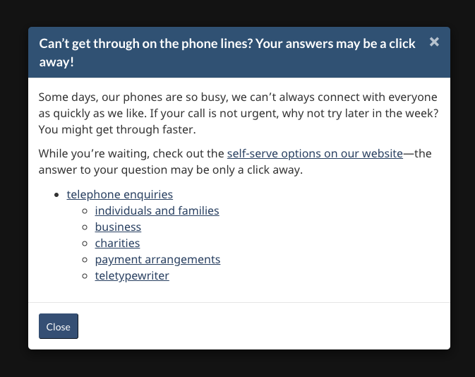
As well as measuring task success rates, the team analyzed user behaviour by watching videos of the tests. This let us see where people struggled. One of the big challenges we identified was that people sometimes failed to get to the Telephone numbers page. They first had to click on the Telephone enquiries link and then go through an overlay where they had to select the type of enquiry. If they did get to the Telephone numbers page, they often chose the wrong phone number from the long list.

Redesigning to help users find the right phone number
Using the results from the baseline testing, the team designed a prototype to address the problems. We focused on the following key design challenges.
Top contact tasks get custom pages
The team created custom contact pages for each of the top call drivers. This way people could find the right contact phone number for their task with a sign-in button above it.
Answers not information
We built a ‘Find a phone number’ wizard and a chatbot. This helped people quickly find the number they needed without having to look through all of the available options.
Help people choose the correct option
Whenever there was a choice to make that would force a unique answer, we used the collapsible design pattern to hide answers they didn’t need. For example, the phone numbers are different for changing your home address versus changing your business address. Rather than showing both numbers, we first made them choose home or business. By choosing they revealed only the number they needed.
Reduce calls by showing the online option first
We made every page with a phone number show a primary action button with the online option first. People usually don’t want to call. If there is a way to complete the task online, it’s important to make it as easy as possible to sign in and do it.
Group for search engines and humans
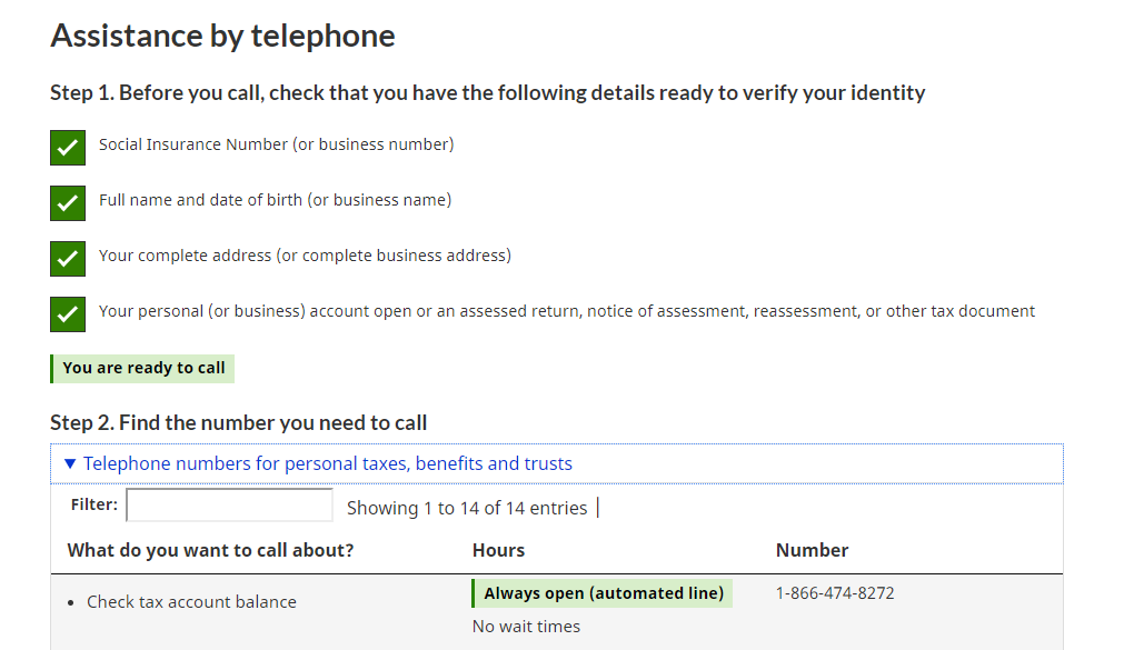
In the baseline study, we noticed that people ended up on the Telephone numbers, Hours of service, or the Contact us pages. Those pages had links to other pages with key additional details. But people rarely followed the links. This meant they didn’t realize for example, that a particular phone line wasn’t open in the evenings or that they had to get some documents ready before they called. The new design presented the phone number along with a checklist to prepare for the call. This included details like the hours and the service offered at that number.

Measuring success
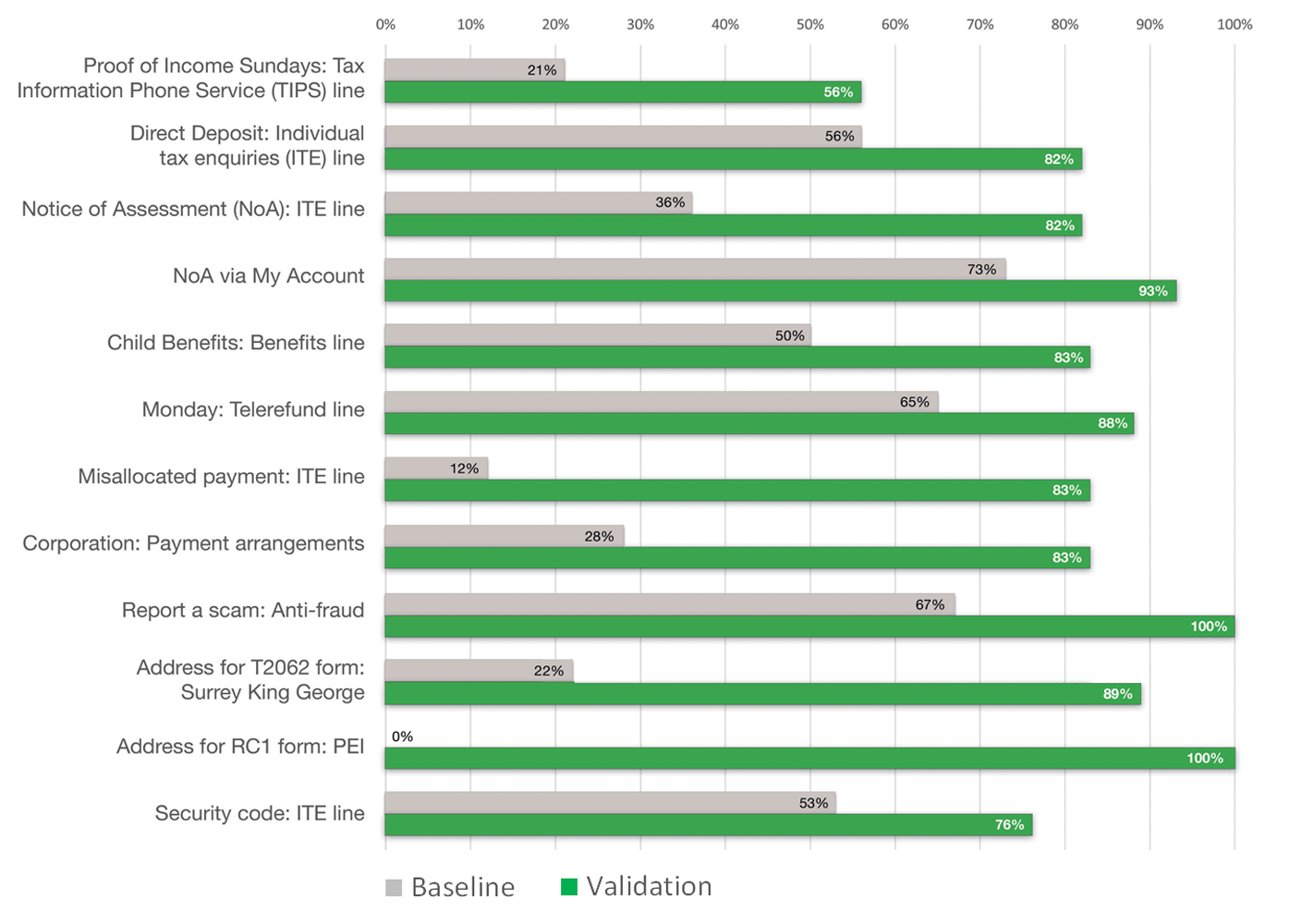
Overall task performance went up from 40% success to 85% when we retested the task scenarios on the prototype.
This chart shows a comparison of task success rates between the baseline and validation tests for all participants.
Task completion success rates – table
| Task | Baseline | Validation |
|---|---|---|
| Proof of Income Sundays - Tax Information Phone Service (TIPS) line | 21% | 56% |
| Direct deposit - Individual tax enquiries (ITE) line | 56% | 82% |
| Notice of Assessment (NoA) - ITE line | 36% | 82% |
| NoA via My Account | 73% | 93% |
| Child Benefits - Benefits line | 50% | 83% |
| Monday - Telerefund line | 65% | 88% |
| Misallocated payment - ITE line | 12% | 83% |
| Corporate - Payment arrangements | 28% | 83% |
| Report a scam - Anti-fraud | 67% | 100% |
| Address for T2062 form - Surrey King George | 22% | 89% |
| Address for RC1 form - PEI | 0% | 100% |
| Security code - ITE line | 53% | 76% |
What we learned
People are more likely to find the right phone number or address when we:
- focus on helping them find the right answer for them
- use wizards and force choices to combat information overload
- create custom contact pages for top call drivers
- group all of the answers for a contact task together including hours of service, how to prepare, and services offered
Request the research
If you’d like to see the detailed research findings from this project, email us at cds.dto-btn.snc@servicecanada.gc.ca.
Let us know what you think
Tweet using the hashtag #Canadadotca.
Explore further
- Read our blog post: Content design tips from our Travel advice and advisories and Contact the CRA optimization projects
- Read overviews of other projects with our partners
Page details
- Date modified:
