Citizenship test optimization project: Research summary
The Canada.ca Experience Office (CEO) and Immigration, Refugees and Citizenship Canada (IRCC) collaborated on the citizenship test optimization project in the summer of 2018. In this project, the team sought to make it easier for people to prepare for the test that most new citizens must take to complete their application for Canadian citizenship.
A team of content designers, design researchers and interaction designers worked with IRCC to define a set of 6 task scenarios related to the citizenship test. Using these scenarios, we completed a total of 214 tests with 36 participants. We tested the existing pages and then re-tested our prototyped improvements. Overall, task success rose by 17% percentage points - to an average of 86% - on the revised prototype.
Establishing a baseline
We selected 19 participants to test the existing pages using the 6 tasks that our team had designed. Our team was trying to measure:
- findability: how often people successfully found the page on the website with the answer to the task question
- success rate: how often people correctly identified and understood the correct answer to the task question
We generated real-world scenarios that reflected what people are actually trying to do. For example:
- When I applied for Canadian citizenship, I was informed about the test. I want to study for it, so I can pass
- When I think I’m ready for the test, I want to find out when I can do it so I can plan the test
- When I am less confident of passing the test, I want to know what happens if I fail so I can understand how I can become a citizen
Redesigning to make it easier for people
Using the results from the baseline testing, the team designed a prototype with task flow in mind. We wanted to simplify the information about the steps after applying and make it easier for applicants to use the study guide. We clarified topic labels and reduced the number of options on the page to eliminate distracting clutter. By using verbs and clearer language in the links and descriptions, the team made it easier for users to discover the right path to the information they needed.
On the live site, the steps to becoming a Canadian citizen were not numbered or listed sequentially. This caused confusion for users. In the prototype, we numbered the steps and grouped them together so users would understand the sequence in which they should be done.
Sequential processes and steps
We clarified and numbered the steps involved in applying for Canadian citizenship. This made it easier to understand and follow the process.
Study guide navigation
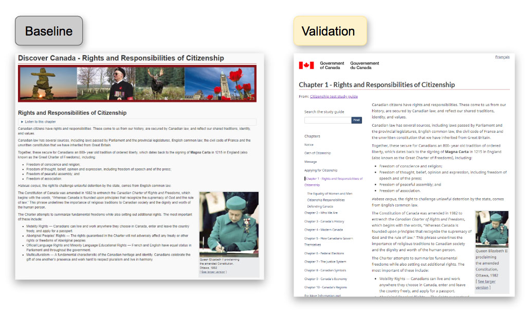
We experimented with a new long-document pattern. We added a “search within” and a left-hand navigation that shows all other chapters. Users were able to easily search the specific chapter and see at a glance other relevant chapters.
No distractions
We removed inline links to help users stay focused on the task. This way they were not distracted by links to additional information. We answered questions they might have directly in the content instead of linking away from the page.
Here is one example of how we reorganized information:

Detailed description
Before:
All the information for this chapter (chapter not numbered) was on one page. The only way to search was to use Ctrl + F. Users would commonly get lost when they began to scroll.
After:
By adding a “search within” and a left-hand navigation, users were more successful at navigating within the document and finding what they needed.
Measuring success
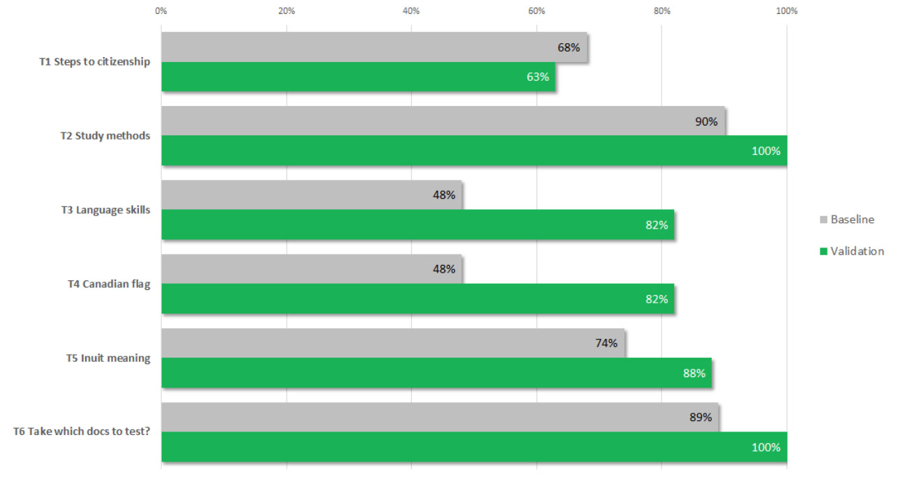
Success! Our target was to improve both findability and task success by a minimum of 20 percentage points, or to exceed 80% for both measures. We re-tested the same 6 tasks on our prototype with 17 new participants. Successful task completion increased by 17 percentage points, to a total of 86%.
This chart shows the success and findability rates of all tasks in baseline and validation phases:
Task completion success rates – table
Baseline measurement at start of project, validation on prototype redesigned by project team.
| Task | Baseline | Validation |
|---|---|---|
| 1. Steps to citizenship | 68% | 63% |
| 2. Study methods | 90% | 100% |
| 3. Language skills | 48% | 82% |
| 4. Canadian flag | 48% | 82% |
| 5. Inuit meaning | 74% | 88% |
| 6. Take which documents to the test | 89% | 100% |
What we learned
Users succeed better when we:
- present step-by-step processes in a clear sequence
- include search and navigation features within long documents
- eliminate distracting links within content
- use plain language and verbs to make labels clearer
Request the research
If you’d like to see the research findings from this project, let us know. Email us at cds.dto-btn.snc@servicecanada.gc.ca.
Let us know what you think
Tweet using the hashtag #Canadadotca.
Explore further
- Read overviews of other projects with our partners
Page details
- Date modified:
