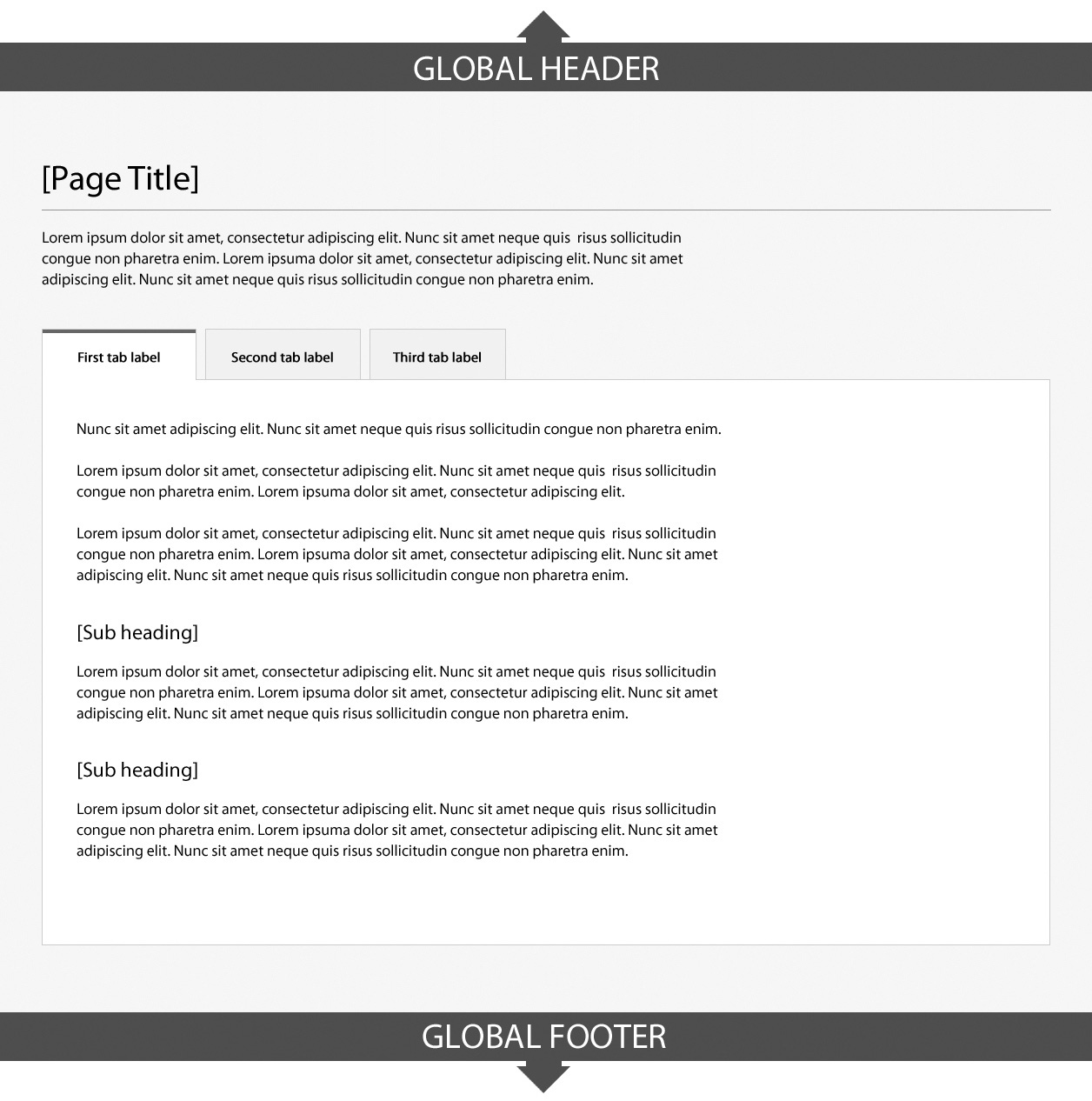
Tabbed interface design pattern: Canada.ca design
The tabbed interface pattern separates related content into different panes that are viewable one at a time when the respective tab is clicked.
Objective
Use the tabbed interface pattern to group and present different aspects of content that are closely related, such as:
- Geographic places, where the tabs can be used to present content relating to a place’s location, demographics, economy, etc.
- Product catalogues, where the tabs can be used to present consistent facets of each product in the catalogue, such as specifications, features, etc.
Do not use the tabbed interface pattern when:
- content must be presented in a specific sequential order (instead, use a step-by-step pattern)
- content needs to be compared and contrasted, which would lead to repeated switching between tabs (instead, use tables or other patterns that allow all content to be presented at once)
- content is lengthy or detailed, because of space limitations in the tabbed interface
- content presentation includes only 2 tabs (for greater efficiency, use subheadings)
How and when to use a tabbed interface
- Use defined presentation classes for the tabbed interface included in WET
- Ensure that tab headers are clear and concise; avoid lengthy labels
- When repeating the tabbed interface across a set of related pages (for example, on country pages), always ensure the tab headers are presented consistently
- Make the default active tab first on page load; but another tab may be used as the active tab on page load if required

Page details
- Date modified: