
GC Feedback: Canada.ca design
Last updated: 2023-10-06
The feedback tool is an optional pattern to collect feedback on the page experience. When in use, it is included at the bottom of the page before the date modified.
On this page
When to use
Consider adding GC Feedback to:
- uncover specific page-level issues affecting your GC Task Success Survey task score
- research issues on pages you plan on working on in the future
- understand if new or existing pages are meeting user needs
- identify emerging issues
- monitor after page improvements have gone live
What to avoid
Avoid using GC Feedback on pages where there is no plan to monitor comments or take action. We also don’t recommend using the tool within secure spaces or pages with sensitive subject material.
Content and design
The feedback tool invites visitors to:
- indicate if they found what they were looking for (yes / no)
- offer their feedback describing the problem
Place the tool at the bottom of the page before the date modified. It's aligned to the left of the page before the “Share this page” widget. You can opt to use GC Feedback in place of the "Report a problem" pattern. It's not mandatory to add the feedback pattern when removing “Report a problem” from your page.
The page feedback pattern has 4 states:
- “Did you find what you were looking for?” prompt with “Yes” and “No” buttons
- Feedback text entry box (with an option to add a customizable contact link)
- A pop-up box when personal information is detected in a comment
- Thank you message
This pattern also has detailed documentation for use and analysis of feedback.
GC Feedback (Analytics and feedback)
Content specifications
When you first add the feedback tool to your page, use the default option without the contact link.
Only consider adding a contact link if you have tried to make the page content clearer for how to contact the program or service and users are still using the feedback tool to get a response for their situation.
The link can go to an HTML page or an email address.
Keep the link text short. The recommended wording is “Contact [the Service Name]”
Interactions
The feedback pattern has 4 states:
- "Did you find what you were looking for" prompt
- feedback entry
- personal information detection
- thank you message
For all of these states, the user stays on the same HTML page as they interact with the feedback pattern.
On page load, the feedback pattern displays the prompt “Did you find what you were looking for” followed by buttons for “Yes” and “No”.
If a user selects "Yes" they will only be shown a thank you message.
If a user selects "No" the next step asks the user to provide more details about their experience.
It begins with a heading labelled "Please provide more details", followed by the text "You will not receive a reply. Don't include personal information (telephone, email, SIN, financial, medical, or work details). Maximum 300 characters". After selecting "Submit" from the pop up, the user is shown a thank you message.
Then there is an open text field to capture the feedback.
If the contact option is used, a contact link for the service is placed inside an expand/collapse pattern labeled “Need urgent help with a problem? Contact us” located before the heading and open text field.
The user selects the “Submit” button to send their feedback. After selecting "Submit", the user is shown a thank you message with a green checkmark to indicate that their feedback has been successfully sent or a pop-up message will appear if personal information was detected in the comment.
Upon submitting a comment containing personal information, a pop-up message will replace the prompt.
The pop-up box has a heading, “Personal information in your comment has been removed”.
The user is reminded that they will not receive a response when submitting feedback, “Comments are only used to improve our website. You will not receive a response.”
A preview of the user’s comment is displayed and any personal information replaced by hashtags, “To protect your privacy, your comment will be submitted as:”
There is an expand/collapse pattern with the header “What is considered personal information”. When the expand/collapse pattern is opened, there is a list of types of personal information that can’t be included in the feedback form.
- email address
- telephone number
- postal code
- passport number
- business number
- social insurance number (SIN)
There are two buttons at the bottom of the pop-up.
One button for “Go back and edit comment” and one for “Submit comment”
If a user selects “Go back and edit comment” they return to the original comment text field.
If a user selects, “Submit comment”, the comment will be submitted with redaction automatically applied and a thank you message will be shown.
Design specifications
The feedback pattern replaces the "Report a problem" pattern when in use.
Grey well
- Well class: well mrgn-bttm-0
Typography
- Heading: font-size: 16px
- Body text: small font-size: 87%
Buttons
- Position: The buttons are to the right of the "Did you find what you were looking for" prompt. The ‘Yes’ button is to the left of the ‘No’ button
- Button class: btn btn-primary
Thank you checkmark icon
- Position: left of the "Thank you" message
- Checkmark icon: glyphicon glyphicon-ok
- Checkmark colour: success class
Visual examples
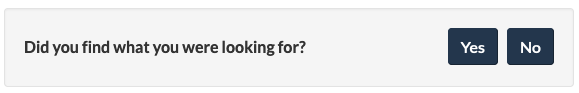
1. Initial view of the feedback tool
Image description: Initial view of the feedback tool
On page load, the feedback is located at the bottom of the web page above the date modified. A small gray well includes the prompt “Did you find what you were looking for?” followed by buttons for “Yes” and “No”.
2a. Default view after selecting "No"
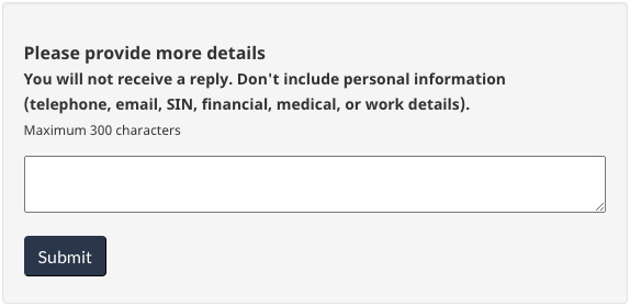
Image description: Default view after selecting "No"
After interacting with the “No” button, a text entry screen will replace the prompt. There is a heading for “Please provide more details” followed by instructions to not include personal information: “You will not receive a reply. Don’t include personal information (telephone, email, SIN financial, medical, or work details. Maximum 300 characters.” There is a small text entry box followed by a button for “Submit”.
2b. Optional view after selecting "No" with contact option
The expand/collapse pattern labeled “Need urgent help with a problem? Contact us” will be closed by default.
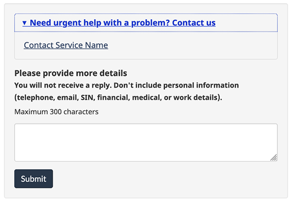
Image description: Optional view after selecting "No" with contact option
After interacting with the “No” button, a text entry screen will replace the prompt.
In the contact option, there is an expand/collapse pattern with the header “Need urgent help with a problem? Contact us”. When the expand/collapse pattern is opened, there is a customizable link to contact the service.
After the expand/collapse pattern, there is a heading for “Please provide more details” followed by instructions to not include personal information: “You will not receive a reply. Don’t include personal information (telephone, email, SIN financial, medical, or work details). Maximum 300 characters.” There is a small text entry box followed by a button for “Submit”.
3. View after selecting "Yes" or after submitting feedback
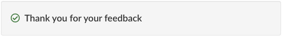
Image description: View after selecting "Yes" or after submitting feedback
When users select “Yes” from the initial prompt or after submitting their feedback, a thank you message is displayed. There is a green checkmark icon followed by the heading “Thank you for your feedback”.
4. Optional view after including personal information is detected in the comment
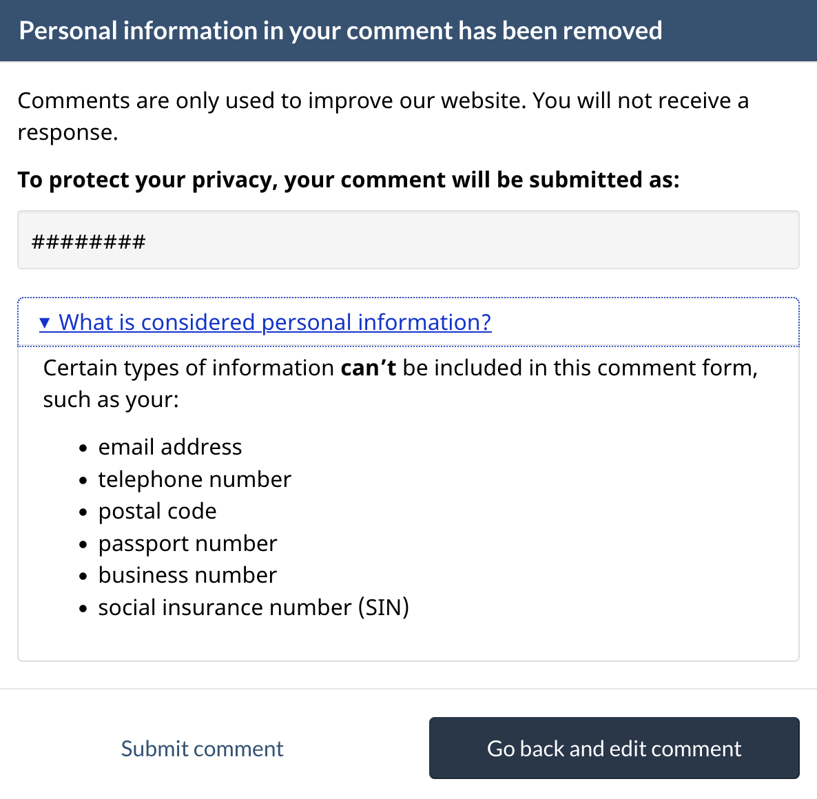
Image description: Optional view after including personal information is detected in the comment
The expand/collapse pattern labeled “What is considered personal information?” will be closed by default. If the “Go back and edit comment” button is clicked, the view will close automatically and show view 2a. Otherwise, if the “Submit comment” button is clicked, the view will become view 3.
How to implement
Add the feedback tool to the bottom of a content page after the page content and before the date modified.
Feedback tool code for pages on the Managed Web Service (MWS)
Use this feedback code for any page hosted on the Adobe Managed Web Service.
Instructions for MWS pages
Add the feedback component
How to add the feedback component to your page in Adobe Experience Manager (AEM). (Internal only on GCPedia)
Optional Add a “section” hidden value in the feedback code
This is useful when you want to download feedback for multiple pages at the same time.
Consider including this value when you're adding the feedback tool to multiple pages on the same topic, such as “passports” or “employment insurance”.
This is a unilingual value - enter the English section value to your English and French pages.
If you would like to add a new section value that is not currently in the Feedback Viewer, contact the Canada.ca Experience Office. We will add the new section value into the Feedback Viewer.
Email: dsd.ceo-bec.dsn@servicecanada.gc.ca
Optional Contact link
Only consider adding a contact link if you have tried to make the page content clearer for how to contact the program or service and users are still using the feedback tool to get a response for their situation.
Feedback tool code for pages outside the Managed Web Service (MWS)
Use these instructions for any page that is not hosted on the Adobe Managed Web Service.
Instructions for non-MWS pages
Add the feedback component
Insert the feedback tool code where the “Report a problem on this page” is located in your page's HTML.
Recommended Add a "theme" hidden value in the feedback code
This is useful when you want to download feedback for an entire theme of pages at the same time.
In most cases, you should include the Canada.ca theme for your content (full list below).
This is a unilingual value - enter the English theme value to your English and French pages.
Canada.ca theme values
- AboutGov
- Benefits
- Business
- CanadaTheWorld
- Culture
- Defense
- Environment
- Health
- Immigration
- Indigenous
- Jobs
- Money
- Policing
- PublicService
- Science
- Taxes
- Transport
- Travel
- Veterans
If you would like to add a new theme value that is not currently in the Feedback Viewer, contact the Canada.ca Experience Office. We will add the new theme value into the Feedback Viewer.
Email: dsd.ceo-bec.dsn@servicecanada.gc.ca
Optional Add a “section” hidden value in the feedback code
This is useful when you want to download feedback for multiple pages at the same time.
Consider including this value when you're adding the feedback tool to multiple pages on the same topic, such as “passports” or “employment insurance”.
This is a unilingual value - enter the English section value to your English and French pages.
If you would like to add a new section value that is not currently in the Feedback Viewer, contact the Canada.ca Experience Office. We will add the new section value into the Feedback Viewer.
Email: dsd.ceo-bec.dsn@servicecanada.gc.ca
Optional Contact link
Only consider adding a contact link if you have tried to make the page content clearer for how to contact the program or service and users are still using the feedback tool to get a response for their situation.
Accessing and analyzing feedback
Feedback can be viewed and downloaded as CSV or Excel files at any time using the Feedback Viewer website.
The Feedback Viewer is a password protected environment available to all page feedback participants. Contact the DTO to get access to the site.
Research and rationale
Research findings
Blog post: Collect feedback, find issues
Policy rationale
The Guideline for Service and Digital requires client feedback to be an integral part of service or product design. It can take several forms, including using GC Feedback.
Page details
- Date modified: