Contact information design pattern: Canada.ca design
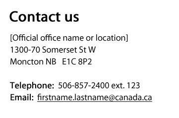
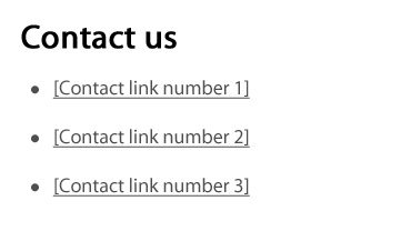
There are 2 patterns for presenting contact information on Canada.ca pages. The contact information pattern is a standardized block that presents the street or mailing address, email address and telephone numbers, while the contact links pattern presents links to contact pages.
When to use this pattern
- Present contact information consistently in a variety of contexts
- Provide access to multiple contact options.
How to use this pattern
- The heading is “Contact us”
- Do not add borders to this block
- the aim is to reduce visual noise and avoid “banner blindness” (where people automatically interpret content in boxes as ads)
- For the contact address pattern:
- when street or mailing address information is available, place it first, followed by other contact channels
- follow the Canada.ca Content Style Guide when writing text for this block
- label telephone, email, TTY, etc., numbers appropriately, for example “Telephone:” for a telephone number
- where possible, the email link must point to a web form rather than presenting a mailto link
- For the contact links pattern:
- use standard link styles
- use bullets, not numbered lists
- links point to contact pages (see the Contact us templates section)
Working example
Examples


Page details
- Date modified: